
AppboyKit(OBJECTIVE-C SDKとも呼ばれます)はサポートが終了しており、Swift SDKに置き換えられました。新機能、バグ修正、セキュリティ更新、テクニカルサポートは提供されません。ただし、メッセージングと分析は引き続き通常どおり機能します。詳しくは、新しいBraze Swift SDKの紹介を参照してください。
Content Cardsのフィードをカスタマイズする
ABKContentCardsTableViewController を拡張してすべてのUI要素とContent Cardsの動作をカスタマイズすることで、独自のContent Cardsインターフェイスを作成できます。Content Cardsセルをサブクラス化してからプログラムで使用することも、新しいクラスを登録するカスタムストーリーボードを導入することによって使用することもできます。完全な例については、Content Cardsのサンプルアプリをご確認ください。
また、サブクラス化戦略を使用すべきか、完全にカスタムのビューコントローラーを使用してデータ更新を配信登録すべきかを検討することも重要です。たとえば、ABKContentCardsTableViewController をサブクラス化する場合は、populateContentCards メソッドを使用してカードのフィルター処理と順序付けを行うことができます(推奨)。ただし、ビューコントローラーを完全にカスタマイズすると、カルーセルでの表示やインタラクティブ要素の追加など、カードの動作をより詳細に制御できるようになりますが、順序付けとフィルター処理のロジックを実装するためにオブザーバーに頼らなければなりません。また、インプレッション、却下イベント、クリックを適切に記録するには、それぞれの分析メソッドを実装する必要もあります。
UIをカスタマイズする
次のコードスニペットは、SDKが提供するメソッドを使用して、UIのニーズに合わせてContent Cardsのスタイル設定と変更を行う方法を示しています。これらのメソッドによって、カスタムフォント、カスタマイズされたカラーコンポーネント、カスタマイズされたテキストなど、Content Cards UIのあらゆる側面をカスタマイズすることができます。
Content Cards UIをカスタマイズする方法は2通りあります。
- ダイナミックメソッド: カードごとにカードUIを更新する
- スタティックメソッド: すべてのカードでUIを更新する
ダイナミックUI
Content Cardsの applyCard メソッドはカードオブジェクトを参照し、UIの更新に使用されるキーと値のペアを渡すことができます。
- (void)applyCard:(ABKCaptionedImageContentCard *)captionedImageCard {
[super applyCard:captionedImageCard];
if ([card.extras objectForKey:ContentCardKeyBackgroundColorValue]) {
NSString *backgroundColor = [card.extras objectForKey:ContentCardKeyBackgroundColor];
if ([backgroundColor colorValue]) {
self.rootView.backgroundColor = [backgroundColor colorValue];
} else {
self.rootView.backgroundColor = [UIColor lightGray];
}
} else {
self.rootView.backgroundColor = [UIColor lightGray];
}
}
override func apply(_ captionedImageCard: ABKCaptionedImageContentCard!) {
super.apply(captionedImageCard)
if let backgroundColor = card.extras?[ContentCardKey.backgroundColor.rawValue] as? String,
let backgroundColorValue = backgroundColor.colorValue() {
rootView.backgroundColor = backgroundColorValue
} else {
rootView.backgroundColor = .lightGray
}
}
スタティックUI
setUpUI メソッドは、すべてのカードで静的なContent Cardsコンポーネントに値を割り当てることができます。
#import "CustomClassicContentCardCell.h"
@implementation CustomClassicContentCardCell
- (void)setUpUI {
[super setUpUI];
self.rootView.backgroundColor = [UIColor lightGrayColor];
self.rootView.layer.borderColor = [UIColor purpleColor].CGColor;
self.unviewedLineView.backgroundColor = [UIColor redColor];
self.titleLabel.font = [UIFont italicSystemFontOfSize:20];
}
override func setUpUI() {
super.setUpUI()
rootView.backgroundColor = .lightGray
rootView.layer.borderColor = UIColor.purple.cgColor
unviewedLineViewColor = .red
titleLabel.font = .italicSystemFont(ofSize: 20)
}
カスタムインターフェイスを提供する
カスタムインターフェイスを提供するには、必要なカードタイプごとにカスタムクラスを登録します。
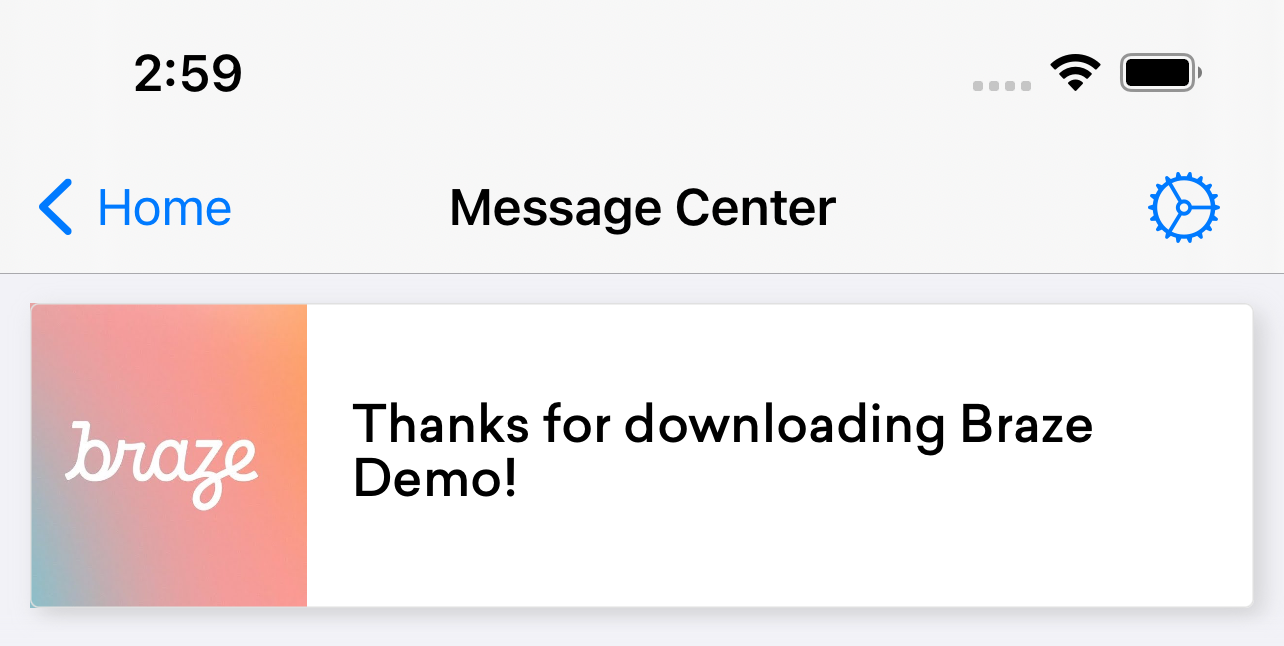
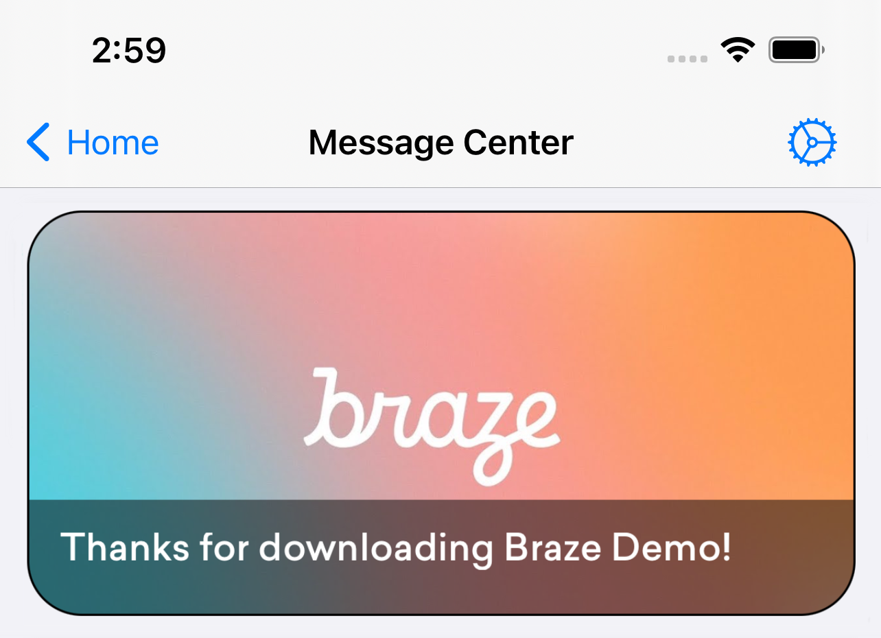
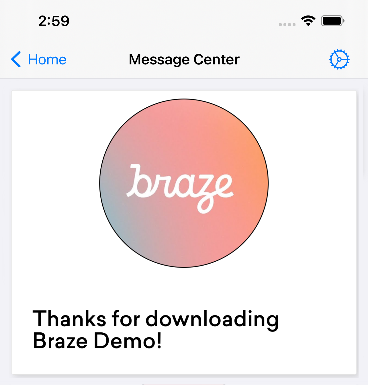
Brazeには、3つのContent Cardsテンプレート(バナー、キャプション付き画像、クラシック)が用意されています。独自のカスタムインターフェイスを提供する場合は、次のコードスニペットを参照してください。
- (void)registerTableViewCellClasses {
[super registerTableViewCellClasses];
// Replace the default class registrations with custom classes for these two types of cards
[self.tableView registerClass:[CustomCaptionedImageContentCardCell class] forCellReuseIdentifier:@"ABKCaptionedImageContentCardCell"];
[self.tableView registerClass:[CustomClassicContentCardCell class] forCellReuseIdentifier:@"ABKClassicCardCell"];
}
override func registerTableViewCellClasses() {
super.registerTableViewCellClasses()
// Replace the default class registrations with custom classes
tableView.register(CustomCaptionedImageContentCardCell.self, forCellReuseIdentifier: "ABKCaptionedImageContentCardCell")
tableView.register(CustomBannerContentCardCell.self, forCellReuseIdentifier: "ABKBannerContentCardCell")
tableView.register(CustomClassicImageContentCardCell.self, forCellReuseIdentifier: "ABKClassicImageCardCell")
tableView.register(CustomClassicContentCardCell.self, forCellReuseIdentifier: "ABKClassicCardCell")
}
値が挿入されたContent Cardsをオーバーライドする
Content Cardsをプログラムで変更するには、populateContentCards メソッドを使用します。
- (void)populateContentCards {
NSMutableArray<ABKContentCard *> *cards = [NSMutableArray arrayWithArray:[Appboy.sharedInstance.contentCardsController getContentCards]];
for (ABKContentCard *card in cards) {
// Replaces the card description for all Classic Content Cards
if ([card isKindOfClass:[ABKClassicContentCard class]]) {
((ABKClassicContentCard *)card).cardDescription = @"Custom Feed Override title [classic cards only]!";
}
}
super.cards = cards;
}
override func populateContentCards() {
guard let cards = Appboy.sharedInstance()?.contentCardsController.contentCards else { return }
for card in cards {
// Replaces the card description for all Classic Content Cards
if let classicCard = card as? ABKClassicContentCard {
classicCard.cardDescription = "Custom Feed Override title [classic cards only]!"
}
}
super.cards = (cards as NSArray).mutableCopy() as? NSMutableArray
}