Channel performance dashboards
Channel performance dashboards show aggregate performance metrics for an entire channel, from both campaigns and Canvases. These dashboards are currently available for email, push, and SMS.
Dashboards
Select a tab to view details for available channel performance dashboards.
Email performance dashboard
View your email performance dashboard by going to Analytics > Email Performance, and selecting the date range for the period you want to view data. Your date range can be up to one year in the past.

To view the Email Performance dashboard, you need the “View Usage Data” or “View Dashboard Reports” permission.


How metrics are calculated
The calculations for different metrics in the email performance dashboard are the same as those on an individual message level (such as campaign analytics). On this dashboard, the metrics are aggregated across all campaigns and Canvases for the date range you’ve selected. To learn more about these definitions, refer to Email metrics.
Each tile shows the rate metric first, followed by the count metric (with the exception of Sends, which displays the count metric followed by the average per day). For example, the unique clicks tile contains the Unique click rate from your selected time period and the count of the total number of unique clicks from that time period. Each tile also shows the comparison to the last period.
| Metric | Type | Calculation |
|---|---|---|
| Sends | Count | Total number of sends across each day in the date range |
| Delivery rate | Rate | (Total number of deliveries across each day in the date range) / (Total number of sends across each day in the date range) |
| Bounce rate | Rate | (Total number of bounces across each day in the date range) / (Total number of sends across each day in the date range) |
| Unsubscribe rate | Rate | (Total number of unique unsubscribes across each day in the date range) / (Total number of deliveries for a date range) This uses unique unsubscribes, which is also used in Campaign Analytics, Overview, and Report Builder. These unsubscribes are logged across all sources (such as the , REST API, CSV imports, emails, and list unsubscribes). The unsubscribe rates in Campaign and Canvas analytics are unsubscribes that occur as a result of an unsubscribe click on a Braze-delivered email. |
| Unique open rate | Rate | (Total number of unique opens across each day in the date range) / (Total number of deliveries for a date range) |
| Other opens rate | Rate | (Total number of total other opens across each day in the date range) / (Total number of deliveries for date range) Other opens includes emails that haven’t been identified as machine opens, such as when a user opens an email. This metric is non-unique and is a sub-metric of total opens. |
| Unique click rate | Rate | (Total number of unique clicks across each day in the date range) / (Total number of deliveries for a date range) |
| Unique click to open rate | Rate | (Total number of unique clicks across each day in the date range) / (Total number of unique opens across each day in the date range) |
Email insights dashboard
The email insights dashboard tracks where and when your customers are interacting with your emails. These reports can provide rich and granular data on how to optimize your emails to drive greater engagement. The email insights dashboard includes up to the last six months of data. To access the dashboard, go to Analytics > Email Performance > Email Insights.
Engagement by Device
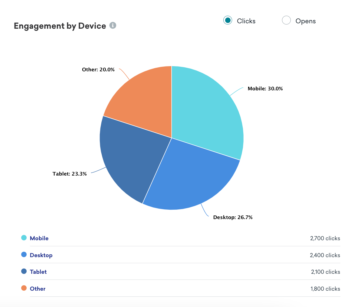
The Engagement by Device report provides a breakdown of what devices your users are using to engage with your email. This data tracks email engagement across mobile, desktop, tablet, and other device types. This data is based on the user agent string passed from your users’ devices.
If you use CloudFront as your CDN, make sure your users’ user agent is passed along to the ESP. Otherwise, every user agent will be “Amazon Cloudfront”.
The “Other” category includes any user string that cannot be identified as desktop, mobile, or tablet. For example, television, car, video game console, OTT (over-the-top or streaming), and similar. This may also include null or empty values.
To better understand what is in this “Other” category, you can extract the user agents using either of these options:
- Currents will send you the exact user agent string that was retrieved from your users’ devices.
- Leverage our Query Builder to use SQL or our AI Query Builder to view the user agents.
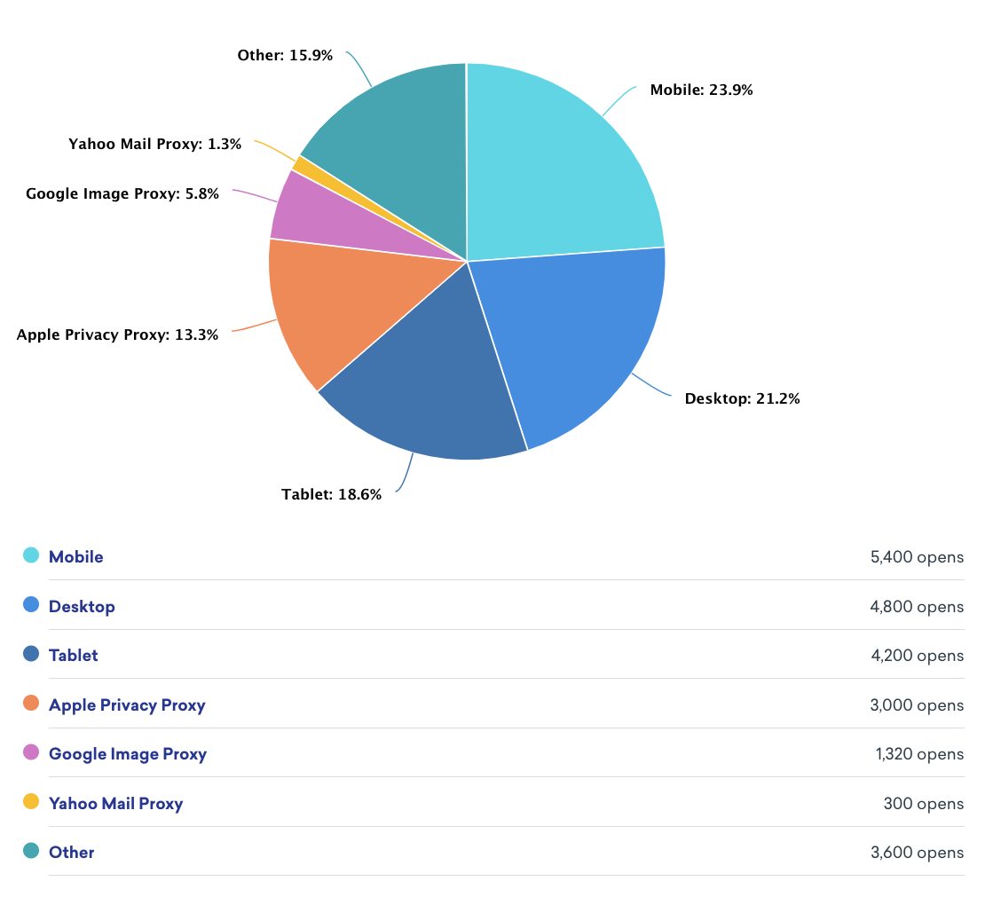
For email opens, Braze will separate Google Image Proxy, Apple Image Proxy, and Yahoo Mail Proxy. These services will cache and load all embedded images in an email before it’s delivered to the recipient. As a result, this will trigger an email open from the mailbox provider’s servers rather than the recipient’s server, which can lead to inflated email opens. These services are meant to enhance privacy, security, performance, and efficiency when loading images. This can also contain real opens from recipients, as these proxy services mask the user agent, and Braze categorizes proxy data using the user agent.
Engagement by Mailbox Provider
The Engagement by Mailbox Provider report displays the top mailbox providers contributing to your clicks or opens. You can click into specific premier mailbox providers to drill down into specific receiving domains. For example, if Microsoft is listed on this report as one of your top mailbox provider metrics, you can further view details for their receiving domains, such as “outlook.com”, “hotmail.com”, “live.com”, and more.

Time of Engagement
The Time of Engagement report displays data on when users are engaging with your emails. This can help answer questions such as which weekday or what time sees the highest engagement from your customers. With these insights, you can experiment with the best day or time to send your messages to drive higher engagement. Note that these times are based on your company’s time zone.
The Day of the week engagement report breaks down opens or clicks by day of the week.

The Time of the day engagement report breaks down opens or clicks by each hour in a 24-hour time window.

For more information on analytics for your emails, check out Email reporting.
SMS performance dashboard
To use your SMS performance dashboard, go to Analytics > SMS Performance, and select the date range for the period you want to view data. Your date range can be up to one year in the past.
How metrics are calculated
The calculations for different metrics in the SMS performance dashboard are the same as those on an individual message level (such as campaign analytics). On this dashboard, the metrics are aggregated across all campaigns and Canvases for the date range you’ve selected. To learn more about these definitions, refer to SMS metrics.
Each tile shows the rate metric first, followed by the count metric (with the exception of Sends, which displays the count metric followed by the average per day). Each tile also shows the comparison to the last period.
| Metric | Type | Calculation |
|---|---|---|
| Sends | Count | Total number of sends across each day in the date range |
| Confirmed deliveries rate | Rate | (Total number of deliveries across each day in the date range) / (Total number of sends across each day in the date range) |
| Delivery failures rate | Rate | (Total number of failures across each day in the date range) / (Total number of sends across each day in the date range) |
| Rejections rate | Rate | (Total number of rejections across each day in the date range) / (Total number of sends across each day in the date range) |
| Click rate | Rate | (Total number of clicks across each day in the date range) / (Total number of deliveries across each day in the date range) |
| Total opt-ins | Rate | Total number of inbound message opt-ins across each day in the date range |
| Total opt-outs | Rate | Total number of inbound message opt-outs across each day in the date range |
Push performance dashboard
The Push Performance dashboard gives you a channel-level view of push engagement across all your campaigns and Canvases, so you can understand the health of the channel without rolling up data from individual messages.
To open the dashboard, go to Analytics > Push Performance, and select the date range for the period you want to view data. Your date range can be up to one year in the past.
Overview
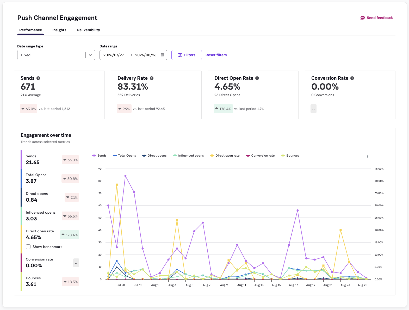
The overview banner summarizes four headline metrics for your selected date range: Sends, Delivery Rate, Open Rate, and Conversion Rate. Each tile shows a primary value, a supporting count, and a tooltip with additional statistical detail.
Conversion rate on this dashboard is scoped to your primary conversion event only. To analyze secondary conversion events, use Report Builder.
Engagement over time
In the engagement over time section, each metric is plotted as a line chart across your selected date range:
- Sends
- Total opens
- Direct opens
- Influenced opens
- Direct open rate
- Conversion rate
- Bounces
You can toggle an industry benchmark onto the direct open rate chart. Benchmarks are off by default. For more, see Benchmarking.
How metrics are calculated
The calculations for different metrics in the push performance dashboard are the same as those on an individual message level (such as campaign analytics). On this dashboard, the metrics are aggregated across all campaigns and Canvases for the date range you’ve selected. For metric definitions, refer to Report Metrics Glossary and filter by Push. For more information about influenced opens, see Influenced opens.
Each tile shows the rate metric first, followed by the count metric (with the exception of Sends, which displays the count metric only). Each tile also shows the comparison to the last period.
| Metric | Type | Calculation |
|---|---|---|
| Sends | Count | Total number of sends across each day in the date range |
| Delivery rate | Rate | (Total number of deliveries across each day in the date range) / (Total number of sends across each day in the date range) |
| Bounce rate | Rate | (Total number of bounces across each day in the date range) / (Total number of sends across each day in the date range) |
| Direct open rate | Rate | (Total number of direct opens across each day in the date range) / (Total number of deliveries across each day in the date range) |
| Influenced open rate | Rate | (Total number of influenced opens across each day in the date range) / (Total number of deliveries across each day in the date range) |
| Total open rate | Rate | (Total number of total opens across each day in the date range) / (Total number of deliveries across each day in the date range) Total opens includes both direct opens and influenced opens. |
| Conversion rate | Rate | (Total number of primary conversions across each day in the date range) / (Total number of recipients across each day in the date range) |
Push insights dashboard
The push insights dashboard surfaces patterns in how your audience responds to push, so you can adjust what you send and how often. To access it, go to Analytics > Push Performance > Insights.
Frequency
The frequency report shows the relationship between how many push notifications a user receives and their open rate, so you can find the point where additional sends stop earning engagement. The chart highlights a recommended send volume based on benchmark data for your vertical.

The frequency and cadence reports use a minimum three-month analysis window. If you select a shorter date range, Braze may expand the start date to include up to three months of data when available. These reports aren’t affected by the tag, campaign, Canvas, or platform filters—they always reflect your full push volume for the selected date range.
Cadence
Where the frequency report tells you how many messages to send, the cadence report tells you how to space them out. It plots open rate against sending cadence, so you can see whether clustering your sends—for example, three pushes all landing on a weekend—costs you engagement compared to spreading them across the week.
Use it alongside the frequency report: frequency sets your volume target, cadence sets the distribution.
Campaign performance distribution
This report plots every push campaign in your date range by open rate and conversion rate, so you can see your strongest and weakest performers side by side and look for what they have in common.
On the campaign performance distribution chart, click the three dots icon and select View data table, which exposes a sortable table that lists the same campaigns. You can sort by open rate or conversion rate to rank performers, and use it to open an individual campaign’s analytics.
Push deliverability dashboard
The push deliverability dashboard tracks the health of your push audience over time, so you can see how your messaging affects your reachable base. To access it, go to Analytics > Push Performance > Deliverability.
This dashboard is filtered by date range only, and each metric is broken down by platform.
Bounce rate
Bounces across your selected date range, broken out by platform. You can toggle an industry benchmark onto this chart. It’s off by default.
Uninstall rate
Uninstalls across your selected date range, broken out by platform. Use this to see whether a heavy sending period coincided with users dropping off. Uninstall data depends on your uninstall tracking setup. See Uninstall tracking. Uninstall tracking is supported for iOS, Android (excluding Huawei), and Kindle. If uninstall tracking is turned off, uninstall rate data is less complete and may be less accurate. Depending on the operating system, uninstall reports may arrive later or in batches, so the chart might not reflect the exact uninstall date.
How metrics are calculated
| Metric | Type | Calculation |
|---|---|---|
| Uninstall rate | Rate | (Total number of devices where Braze has received a signal that they were uninstalled across each day in the date range) / (Total number of devices with valid tokens across each day in the date range) |
| Bounce rate | Rate | (Total number of bounces across each day in the date range) / (Total number of sends across each day in the date range) |
Dashboard filters
You can filter the data on your dashboard using the following filter options:
- Tag: Choose one tag. When applied, your dashboard will show metrics for only your selected tag. Note that the Push dashboard supports multiple tags.
- Platforms: (Push dashboards only) Choose a push platform, such as All Push, Android, iOS, Mobile combined, Kindle, or Web. When applied, your dashboard displays metrics for only your selected platform.
- Canvas: Choose up to 10 Canvases. When applied, your dashboard will show metrics for only your selected Canvases. If you select a tag filter first, then your options for Canvas filters only include Canvases that have your selected tag.
- Campaign: Choose up to 10 campaigns. When applied, your dashboard will show metrics for only your selected campaigns. If you select a tag filter first, then your options for campaign filters only include campaigns that have your selected tag.
Filters apply differently across the push dashboards. The push performance dashboard supports all filters. The push deliverability dashboard supports date range only, with a platform breakdown shown on each chart. The frequency and cadence reports on the push insights dashboard support date range only.

Comparing time periods
The channel performance dashboard automatically compares the time period you have selected in the date range versus the prior time period, totaling the same number of days. For example, if you choose “Last 7 Days” as your date range in the dashboard, the comparison to the last period will compare the metrics from the last seven days against the seven days prior. If you select a custom date range—let’s say May 10 to May 15, which is six days’ worth of data—the dashboard will compare the metrics from across those days to the metrics from May 4 to May 9.
The comparison is the percentage change between the last and current periods, calculated by taking the difference between the two periods and dividing it by the metric from the last period.
Viewing changes in total counts and rates
You can switch between Show Change in Totals—which compares the total counts (such as the number of emails delivered) between the two periods—and Show Change in Rates—which compares the rates (such as the delivery rate).

Benchmarking
On the push dashboards, you can compare your performance against aggregated, anonymized data from Braze.
Available benchmarks
| Benchmark | Where it appears | Default |
|---|---|---|
| Direct open rate | Push performance | Off |
| Bounce rate | Push deliverability | Off |
| Frequency | Push insights | On |
| Cadence | Push insights | On |
Direct open rate and bounce rate benchmarks are broken out by platform. All push benchmarks are measured against open rate, not conversion rate.
Comparing verticals
Benchmark data is split by vertical. Your dashboard defaults to your account’s vertical, and you can use the dropdown to compare against another.
Comparing regions
Benchmark data is split by region. Your dashboard defaults to your account’s region, and you can use the dropdown to compare against another.
If the latest benchmark data isn’t available for your selected time range, Braze shows a predicted benchmark.
Benchmark data refreshes monthly.
Frequently asked questions
Why is my dashboard displaying empty values?
There are a few scenarios that could lead to empty values for a metric:
- Braze recorded zeros for that particular metric in your selected date range.
- You haven’t sent any messages during the selected date range.
- While there were metrics such as opens, clicks, or unsubscribes for a selected date range, there were no deliveries or sends. In this case, Braze will not calculate a rate metric.
To see more metrics, try expanding the date range.
Why does my email dashboard display more Other Opens than Unique Opens?
For the Unique Opens metric, Braze will deduplicate any repeat opens registered by a given user (whether they include Machine Opens or Other Opens) so that only a single Unique Open is incremented if a user opens multiple times. For Other Opens, Braze does not de-deduplicate.
Why are my frequency and cadence reports empty?
These reports use a three-month analysis window. If your selected range is shorter, Braze may expand the range to include earlier dates when data is available.
If your date range is long enough and the reports are still empty, benchmark data may not yet be available for your workspace. Reach out to Braze Support if you have any questions.
Why don’t my filters change the frequency and cadence reports?
The frequency and cadence reports always reflect your full push volume, because their value comes from measuring total message load on a user. Filtering to a subset of campaigns would understate how many messages that user actually received. Only the date range filter applies. <!—Temporarily hidden until functionality is added
Empty values in your data
If a metric displays “0%” or “0”
This means Braze recorded zero for that particular metric during the time frame you’ve selected.
If a metric displays “N/A”
This means that while Braze recorded positive counts for a particular metric for the time frame you’ve selected, the denominator for the rate calculation (either sends or deliveries in most cases) was zero. This can occur when emails are sent out on one day and opens and clicks are recorded the following days if your selected time frame does not include the date the messages were sent.
If a metric displays “–”
This means Braze hasn’t recorded any data for that metric during the time you selected. If you haven’t set up or sent any emails yet, learn more about how to do so in our dedicated Email section.
—>