In-App Messages of the Future: More Magic than Marketing
Published on April 10, 2020/Last edited on April 10, 2020/8 min read

Ashley Christiano
Principal Customer Marketing Manager, Global SMB at BrazePicture this. Your friend begged you to download that new game so you could till your fields and shear your sheep together. You open it up, eager to burn a few minutes (ahem, hours) of your time and...BAM! You’re getting alerts left, right and center, giving you traumatic flashbacks to the pop-up ads of your childhood. By the time you even get to the push notification opt-in prompt, you’re already overwhelmed. You just wanted to plant some seeds!
This scenario, sadly, is all too common. Even in 2019.
Sometimes we forget that marketing isn’t always about pushing users. Often a gentle reminder at the right time and in the right context can be more effective. In today’s world, every screen is a window of opportunity, and if you’re looking to keep the conversation going inside your app, there’s no substitute for an in-app message.
But weaving that push and pull into a well-choreographed marketing symphony can be a big challenge. From wrapping your head around timing and triggers to figuring out the best channel mix for each campaign and lifecycle stage, there are a lot of rules and variables you’ll need to keep straight to get the best results. And with new screens being added into the mix all the time, keeping up with best practices is more important than ever.
But to understand where in-app messages are headed, let’s back up and take a look at what a good experience now entails.
In-App Messages of the...Present
Communicating the urgency (or lack thereof) of your message can be as simple as choosing the right design. At Braze, we’ve got four out-of-the-box options you can leverage on both apps and websites.
- The Slide-up: When a soft touch is all you need, the slide-up is the perfect pick. These unobtrusive banners—you guessed it—slide in from the top or bottom of the screen.
- The Modal: Rich and bold, but not a full takeover, modal messages are built to convert but not fully interrupt.
- Full Screen: Immerse your customers in a full-screen experience perfect for urgent alerts or take-your-breath-away features.
- Custom HTML: Color outside the lines with the fully customizable Custom HTML option. From videos, scrolling messages, email forms, and more, bring an extra level of interaction to every in-app message with this next-level format. If you can dream it, you can build it.
Choosing the right format can make all the difference. You don’t want to communicate urgent, act-now news with a subtle slide-up. But you also don’t want to interrupt somebody’s experience with nice-to-know but inessential announcements in a full-screen message.
Curious about a few of the brands doing it the right way?
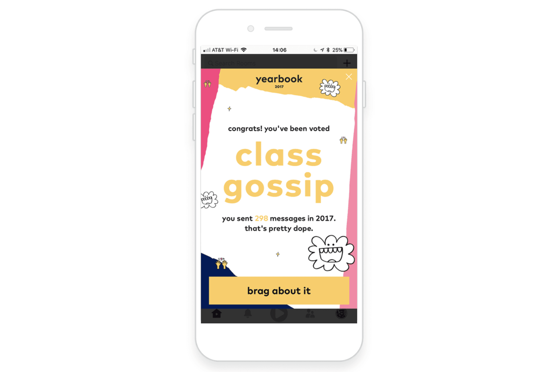
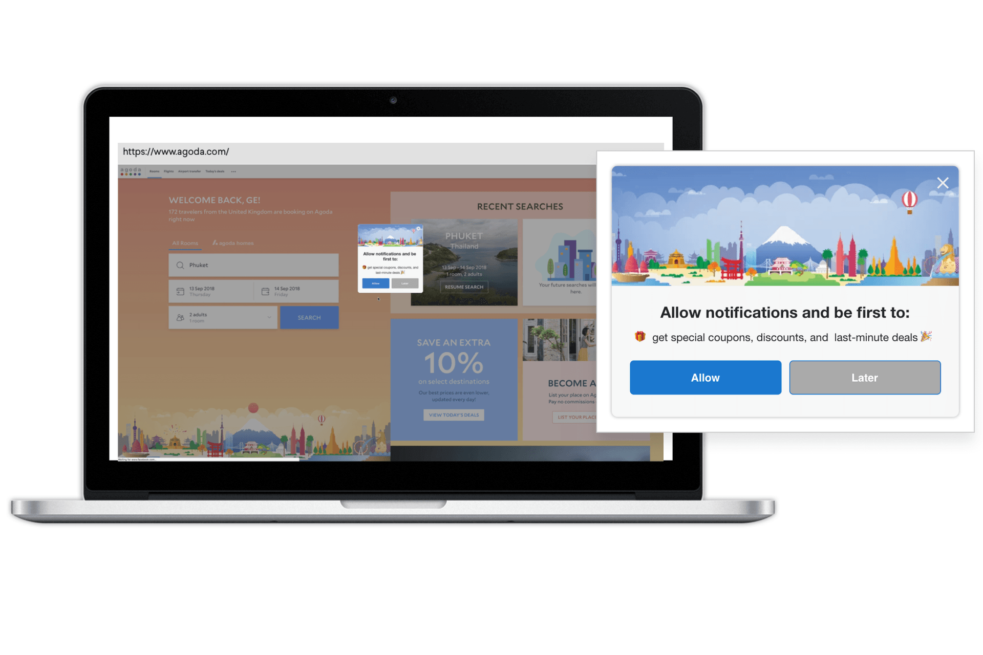
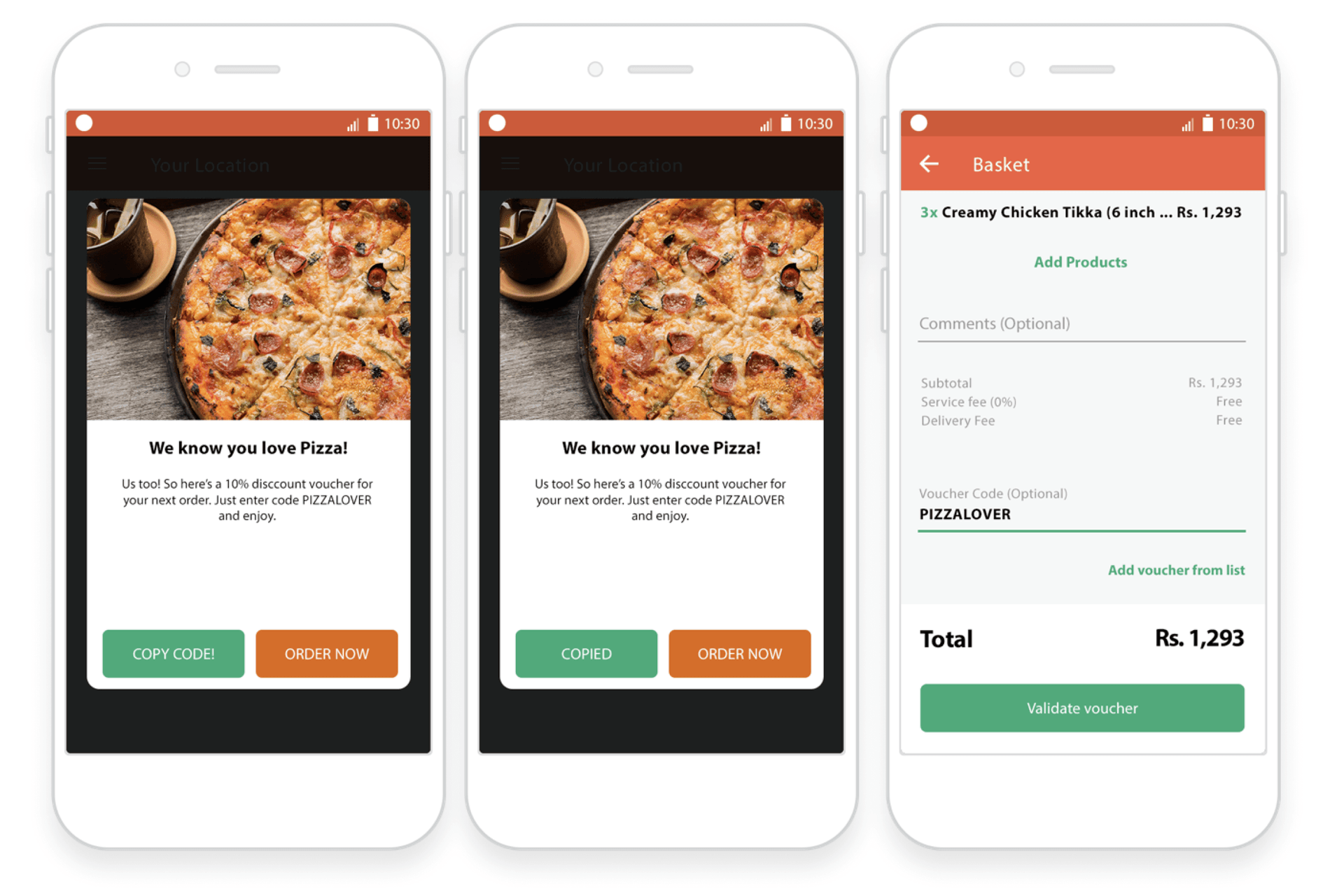
Those are just a few of the many creative, fun, helpful strategies brands are using now to guide customers, share information, and prompt action.
But it’s not all about the content.
Timing is just as important, if not more so, to the user’s overall experience with your in-app or in-browser campaigns.
Few things are more disruptive than the appearance of an in-app message at the start of a session. There are some cases when that kind of timing is actually the right timing, like a product update announcement after a new version has been released, or in the case of past-due bills or other urgent information that users need to act on ASAP.
But do your customers really need to be prompted for app feedback immediately upon entering the app? Probably not.
Add more context to your content with action-based triggers that serve up the perfect message at the most opportune time. If you’re a news apps, maybe that’s after somebody reads an article. If you’re a delivery app, maybe it’s after a customer has browsed a certain number of menus without adding anything to their cart. Do you know the average amount of time a user spends in your app each session? Schedule your message to go out right before that natural drop-off time to prolong their session and add more value to their experience. You get the picture.
On their own, in-app messaging and in-browser messaging are powerful. But mixed with email, push and more? Well, the numbers speak for themselves (but let’s talk about them anyway).
Adding in-app messaging to email outreach is associated with a 186% increase in engagement. Adding push on top of that results in users with engagement levels that are 54% higher than individuals who received cross-channel messages that included just email and in-app messages.
With the right mix of timing and content, you’ll create campaigns that feel like an integral part of the brand experience, instead of an intrusive message users can’t close fast enough.
So, now that you’ve got some 2019 best practices under your belt, let’s look at where in-app messages are going next.
New screens
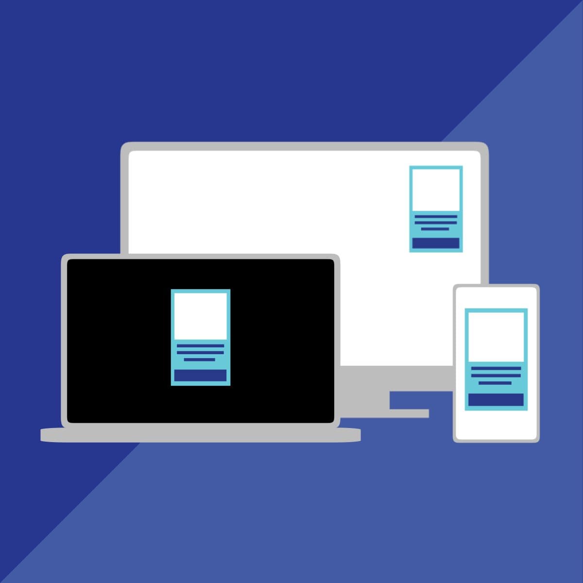
With the rise of connected devices and the growth of each user’s multi-screen experience with brands, in-app messages will likely expand from phones and computers to include platforms like Roku, Apple TV, Fire TV and more.
With more screens at more ratios for more users, knowing what designs, copy, and creative work best will be all the more challenging for brands. Bigger screens with more sizing variety, remote control, the all-important couch:screen distance ratio, the lean back nature of engagement...all of this will play an essential part in the way in-app messages are deployed and displayed on connected TVs.
You’ll also want to think about ways you can incorporate the behavior of users on these larger screens into in-app messaging on their smaller ones. Can your milestone messaging be dynamic enough to reflect use across platforms, for example? Should you trigger that Apple TV feedback prompt if they’ve already rated you on their iPhone?
Level up that cross-channel interaction and envision a message on Apple TV driving toward actions more easily completed on an iPhone. With smart messaging and UX syncing, the interruption to the lean-back experience is minimized, while still getting your users the information they need in the most actionable format...and taking advantage of a captivated audience in their most relaxed state.
Proactive, not reactive
Imagine a world where your in-app messages do more than send a user to a destination or communicate information. In this shiny, new world, in-app messages are an ideal vehicle for collecting user preferences that can then power future marketing campaigns, or even become a fully immersive and helpful part of the app experience.
That could mean asking your customers if they’d like to see more paisley shirts after they just purchased one, or if they’d like to be added to a product beta for a new feature, or RSVP to an upcoming event. With the simple tap of a button, your in-app message will collect those preferences and update the user’s profile with the correct attribute. You can then use that attribute to segment and send new messaging to your customers—all without having to change your app or website.
Preference and Privacy
With the rise of privacy concerns around the world and regulations like GDPR and CCPA, email, push notifications, and online advertising are being held to stricter standards than they were just a few years ago.
Could in-app messaging be next? In-app and in-browsers messages are still the only channel you don’t have to opt in to, after all.
It’s unlikely the in-app messages or in-browser messages will be affected by near-future regulations, but the smart marketer doesn’t just do what’s legal. They do what their users want. In the future, preference centers might go beyond push to include in-app and in-browser communications as well, giving users more options, and marketers a better idea of the kind of marketing pressure each individual user will withstand.
Take this a step further and add in some “snooze” buttons to your in-app messages. Maybe that message didn’t quite hit at the right time for a specific user. It’s not that they’re not interested, they’re just in a hurry, or not ready to pull the trigger on that big-ticket purchase. Instead of only giving them a close button and a call to action, let them take the middle road and snooze the message until a later time. This extends the currently ephemeral nature of your in-app and in-browser messages, giving them a longer shelf-life while also garnering the trust of your customers. If timing is half the battle, then letting your user’s pick the time that works for them seems like a win-win, no?
It’s all about that context
From timing to triggers, design to data use, in-app messages are teed up to be an increasingly important part of a brand’s cross-channel marketing mix. They take your users from “welcome” to “welcome back,” “congratulations” to “keep trying” in a contextual way that, if done right, feels more like magic than messaging.
Want to dig a little deeper into in-app messages and what they can do for you business? Check out our exclusive in-app messaging guide.
Related Tags
Be Absolutely Engaging.™
Sign up for regular updates from Braze.
