Curious What Messages Your Customers Want to Receive? Just Ask!
Published on February 21, 2017/Last edited on February 21, 2017/8 min read


Todd Grennan
Content Production Principal, Content Marketing at BrazeFor today’s marketer, personalization and segmentation can feel like a double-edged sword. The rise of digital marketing tools has made it possible to target your customers more precisely than ever before and to provide an individually customized messaging and brand experience that’s intimate and powerful. But if you’re not careful, it can be easy to cross a line.
Back in 2012, a story broke about Target and how the brand had used a teenage girl’s recent purchases and historical buying behavior to determine that this particular customer was pregnant. Armed with this information, they started to send her coupons for pregnancy-related items, leading to an angry note from the girl’s father, who didn’t know that his daughter was pregnant. That kind of targeting is impressive—but it’s also probably a bridge too far for most customers.
When you’re using advanced segmentation and personalization in your messaging, you’re looking to send outreach that’s useful and relevant to the people receiving it, not to creep them out. There’s a lot of ways to avoid weirding out your audience while using these tools, but one of the most effective ways to find out what kind of outreach your audience wants to receive is also one of the simplest: just ask them.
Preference centers empower users to take control of their brand experience
It doesn’t take a complex algorithm to find out what your audience wants. By asking users what they prefer, you can deliver relevant content to them, in a way they want to receive it.
A preference center is a page within an app or website that lets a user manage their user experience. A preference center can be simple (for example, just allowing users to indicate if they’d be willing to receive push notifications), or they can more nuanced—for instance, allowing users to select what kinds of content they’d like to receive (e.g. new promotions or breaking news), how frequently they’d like to receive messages (e.g. daily, weekly, monthly) and using what messaging channels (e.g. push notifications, email).
Preference centers give users more control of their messaging experience, increasing the chances that they find your outreach relevant and boosting the chances that they engage with your messaging. With a preference center, marketers don’t have to worry that they’re sending too many messages (or irrelevant messages) to a given user, because that user decides what they receive. And if users don’t like what they’re being sent, they can update their preferences or opt out of messages completely.
What a great preference center looks like
Perhaps you’re unaware that some of your favorite apps allow you to customize your experience? Not every app with a preference center highlights that feature, leading some users to slog through a generic messaging experience when they don’t have to. To give you a better idea what’s possible, let’s take a look at three brands that have put together best-in-class preference centers:
Quora
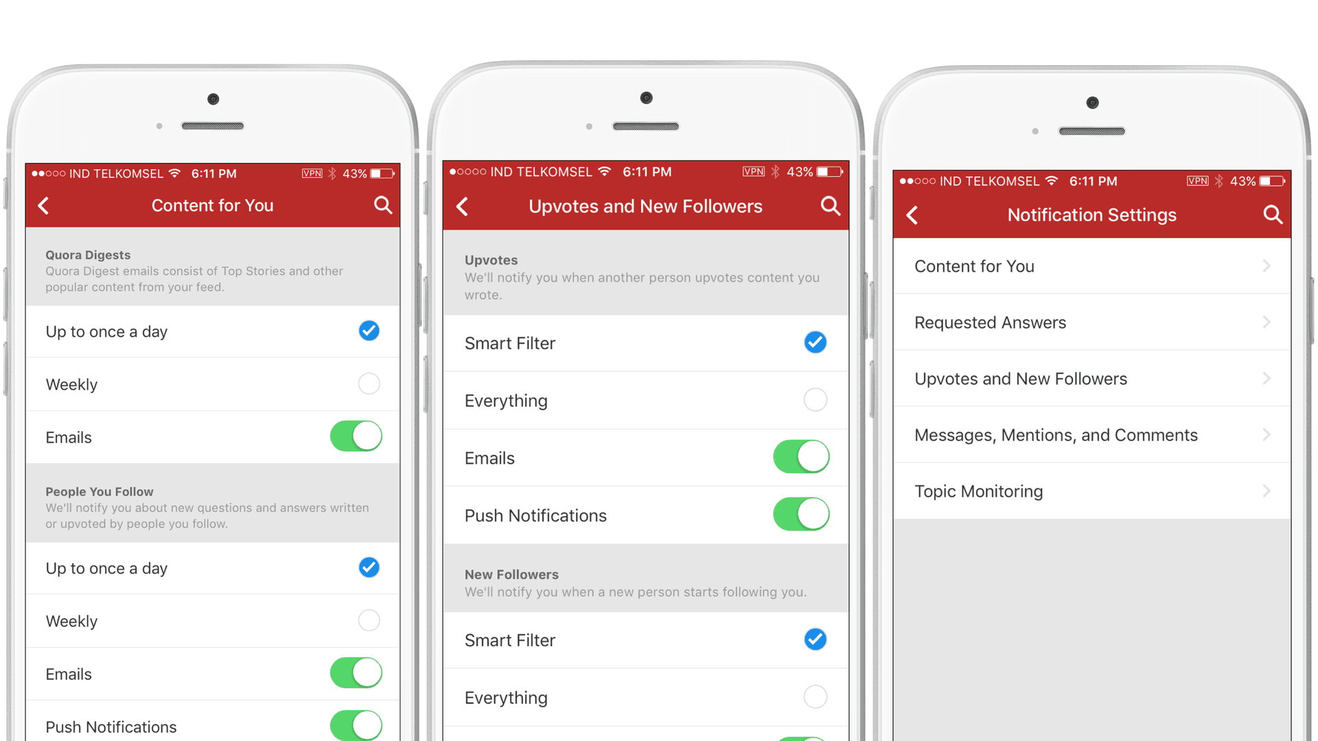
Quora’s preference center
This question and answer site has a preference center that provides a plethora of options for its users. If you’re quite active on the site, it’s easy to become inundated with activity messagingpush notifications and emails for every upvote, new follower, message or mention or comment you receive, every topic you follow, and more!
Quora divides its preference center into five different sections:
- Content for You
- Requested Answers
- Upvotes and New Followers
- Messages, Mentions, and Comments
- Topic Monitoring
Within each of these topics, Quora gives users the flexibility to edit the frequency and channels they’d like to receive notifications from Quora. This granularity is makes it possible for users to get the updates on topics and types of activity they care about, without being overwhelmed with notifications.
ESPN
Being the worldwide leader in sports means you cover a lot of athletic events and topics. Just like the Quora app, if users try to follow everything, they’ll have a convoluted experience, where the messages they’re genuinely interested in are drowned out in a flood of other outreach. ESPN combats this information overload by splitting its preference center into two major sections.
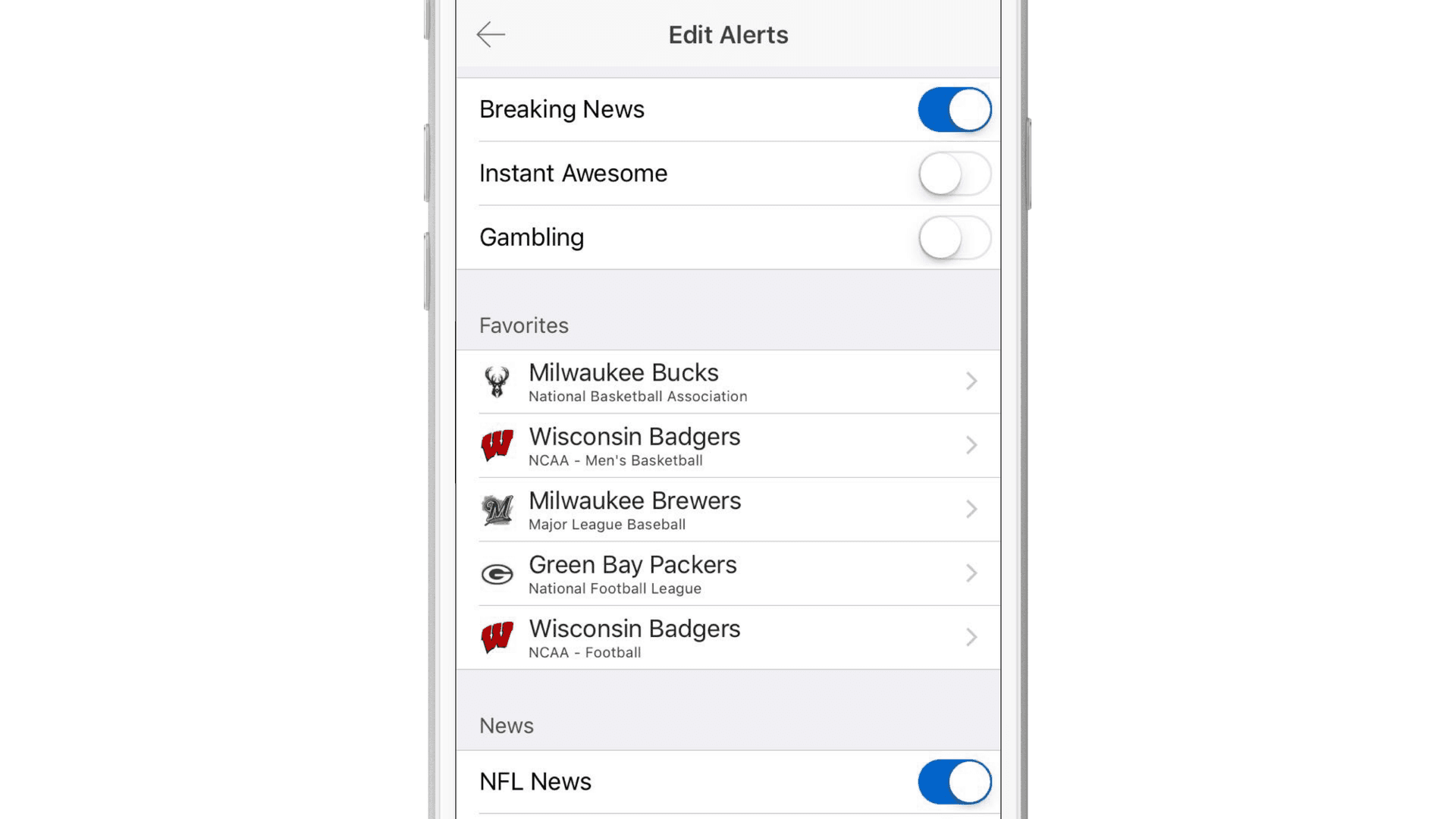
ESPN’s “favorites” section
The first is the “favorites” section. Users can choose their favorite sports teams to follow. Within each team, users are given the option to receive alerts on team news and in-game updates (you can get as detailed as per-quarter updates).
The second option is “news,” based on different sports. Users can opt-in for notifications on the top news from individual leagues like MLB or the WNBA. Or they can get news about sports in general, like golf or tennis. In total, there are 38 different news options a user can select from, making it easy for users to curate exactly the messaging experience they want.
B&H Photo Video
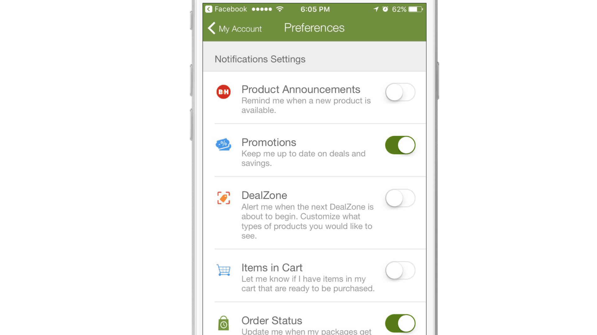
The B&H Photo Video app preference center
B&H Photo Video is an ecommerce brand that specializes in photography, video, and audio–related products. Unlike ESPN and Quora, B&H doesn’t have a lot of new daily content to push to customers, so its preference center doesn’t require the same level of granularity. Instead, B&H keeps its preference center very simple, providing users with six messaging topic options to choose from:
- Product Announcements
- Promotions
- DealZone
- Items in Cart (alert users if there are duplicate items in cart)
- Order Status
- Price Drop (alert users when item in cart has a price drop)
Since the volume of B&H’s notifications is much lower than a content related app, there’s no need to give users the ability to adjust message frequency in their preference center. By sticking to the basics and allowing customers to pick and choose the kinds of alerts they’re interested in, B&H’s simple, clear preference center promote a more pleasant, more valuable brand experience.
How to Promote Preference Center Use
Onboarding
The onboarding process is critical to the long-term value of an app. A poor experience could lead to your app being one of the many apps that never get opened after initial download. By educating new users about the value that your brand can provide and how they can take advantage of it, you can strengthen retention and drive more user engagement. And if you have a preference center, onboarding is the perfect time to educate your audience about what a preference center is and how they can use it to customize their messaging experience.
ESPN does a great job nudging new users to take advantage of its preference center. During your first session, new users are walked through the app’s “favorites” section, where they’re shown every sports league and then given the option to request alerts about specific teams within each league. That tailors new users’ ESPN experience right off the bat, ensuring that they stay up to speed on their favorite teams and bolstering the value that the app can provide.
Don’t Hide the Preference Center
When a brand is putting together a new app, they have a finite amount of screen space to work with. That means they have to be strategic with what content will be prominently displayed and what they tuck away for power users. And different brands make different calls when it comes to how they treat their preference centers.
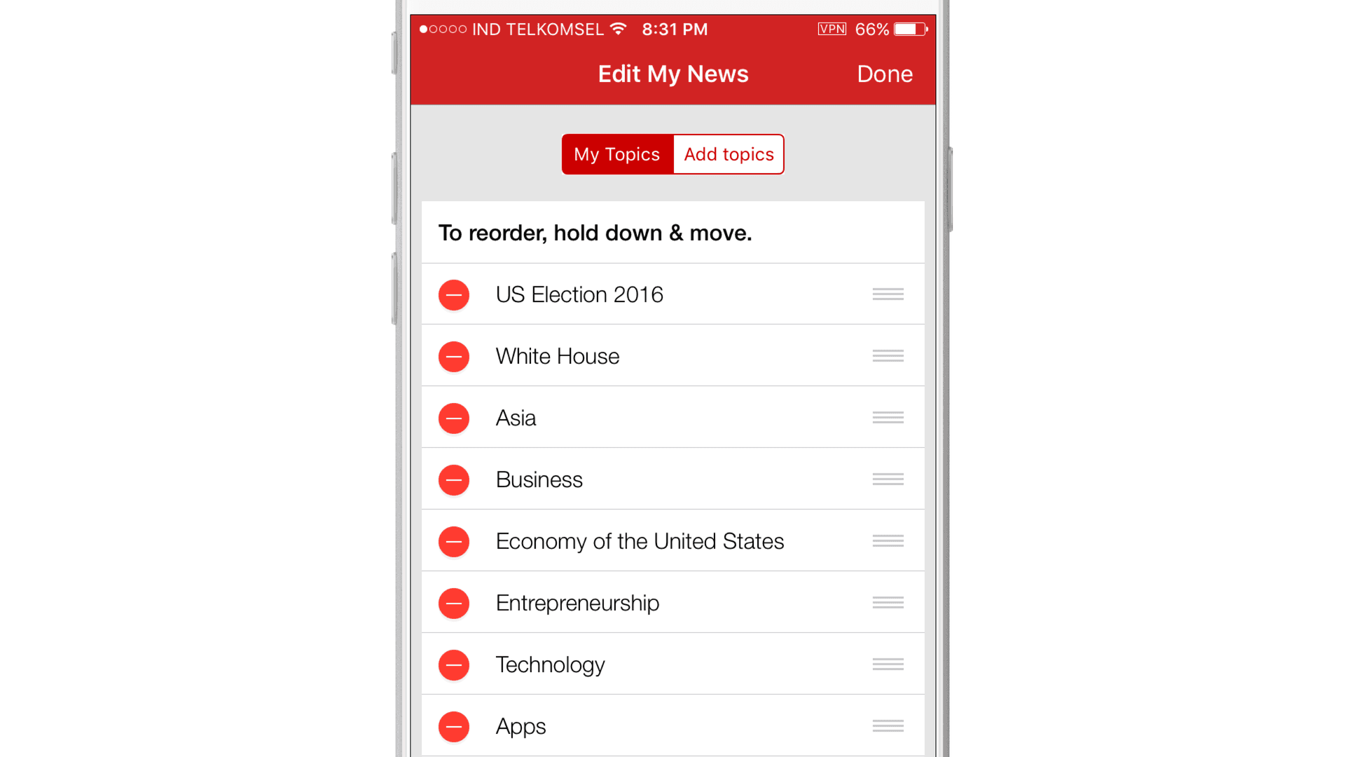
The BBC News app’s preference center
Quora, for instance, makes you hunt a little for its preference center, while BBC News makes its very accessible. This international news app has a menu bar on the top of the app, and the third listed option is something called “My News.” This section features news stories based on the content choices users pre-selected during the app’s onboarding process and allows users to easily edit the topics they want to hear about by tapping on a pencil icon. It’s simple, clear, and easy to use, increasing the chances that app users take advantage of it.
Send a Message
Notify someone about notification preferences via push notification? Seems so meta. But if the purpose of a push notification is to nudge a user to take an action, a push notification about push notifications makes sense. If you notice users are ignoring many of your messages, a reminder that they can customize their notifications can help make your messaging more relevant and appealing to those customers. And if you’re looking to encourage engaged users to take advantage of your preference center, consider using in-app messages and News Feed Cards to remind them about the benefits of customizing their messaging experience.
Final thoughts
Targeted messaging doesn’t have to be a scary concept for your users. If you give the power back to them, you can make this kind of outreach appealing and demonstrate its value in a way that your audience will feel comfortable with. It’s a win-win scenario for both the company and the user: you get more engaged users and they get content that’s actually relevant to their interests and valuable to them. That’s powerful.
Related Tags
Be Absolutely Engaging.™
Sign up for regular updates from Braze.
