Why We Made an In-App Message Style Guide
Published on October 21, 2016/Last edited on October 21, 2016/3 min read

Team Braze
Sometimes we all need a little guidance. Even when it comes to something as common in a marketer’s day as creating a user-facing message, the details can take a lot of time. There are copy considerations like tone and language. Brand-wide considerations like values and marketing personas. And of course design considerations: colors, layouts, and the infinite possibilities thereof.
At Appboy, we empower clients to send beautiful, meaningful, contextual messages to their customers through our platform, the Appboy Dashboard. We also use our own Dashboard to deploy our own marketing campaigns. (My favorites are the conversations about how to send Dashboard messages to Dashboard users, using the Dashboard, about the Dashboard.)
The truth is, the details can make or break a message, so any tool that lets marketers take control and move faster is a great plus. That’s why our content and marketing teams at Appboy refer to brand and editorial style guides in everything we do. And we’ve created a new addition to this family of reference/actionable material: our In-Browser Message Style Guide.
Like many of our clients, we send in-app and in-browser messages to connect with our users, share valuable information, and make their experience better. This style guide is a quick reference for how in-app and in-browser messages add to the experiences we’re building, keeping in mind our brand and user experience goals. No more scrambling through old campaigns to reference color codes or layout preferences; a lovely lookbook of choices is right at our fingertips.
A couple cool things about it:
- We know testing and iterating is the real king of style. Hence, our style guide stresses that it’s not meant to be restrictive or exhaustive. It’s a jumping-off point. We’ll learn as we go, and update the guide accordingly.
- It’s a living part of our library of guidelines. We’ll reference it alongside our brand guidelines, editorial style guide, and of course, the in-app message best practices in our own Academy.
- It was created by our fantastic design team, who owns the Appboy aesthetic and makes sure everything we produce is “us.”
- The Dashboard now allows us to save templates for in-app and in-browser messages, meaning we can swiftly build new campaigns and messages using our style.
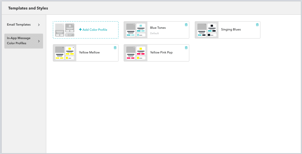
Creating templates in the Appboy Dashboard
Want to get started with your own in-app message templates, and perhaps get your own style guide in the works (or create templates with the one you have)? Check out how in our Academy.
Be Absolutely Engaging.™
Sign up for regular updates from Braze.
Related Content
View the Blog
How iOS 18 is shaping customer engagement—and what marketers can do about it

Haley Trost
Harnessing machine learning in marketing: Benefits, use cases and best practices
Team Braze

The future of payments: Enhancing innovation and trust in a changing landscape
