SwiftUI: A New Frontier in Swift Development
Published on June 03, 2021/Last edited on June 03, 2021/7 min read

Justin Malandruccolo
Forward Deployed Software Engineer, iOSIf you’ve used a Mac, an iPhone, an iPad, or an Apple Watch, you’ve almost certainly had digital experiences supported by Swift, the open-source, Apple-backed programming language for macOS, iOS, watchOS, and tvOS.
At Braze, our platform is designed to support customer engagement in connection with Apple’s digital ecosystem, among others, which makes it important for us to stay up to speed on meaningful developments related to Swift, including the introduction of SwiftUI. One caveat: While I’m far from an expert on SwiftUI, my years working with UIKit have made me curious to explore this new way of working with Swift and share my thoughts with all of you. So let’s dig in!
What is SwiftUI?
First released in 2019, the SwiftUI framework is notable because it represents a groundbreaking new way to develop user interfaces within Swift. While the SwiftUI framework can be used in place of Swift's existing UIKit framework in many circumstances, it's a mistake to think of SwiftUI and UIKit as an either/or proposition. SwiftUI was designed with the flexibility to be woven into existing UIKit projects, allowing developers to use it to supplement UIKit, not just replace it.
My colleague, fellow iOS engineer Louis Bur, describes SwiftUI as "a declarative and reactive way to build UIs, allowing the developer to express concisely both view hierarchies and user interactions." Piggybacking off that, I'd characterize SwiftUI as a truly do-it-yourself new frontier for Swift development. With SwiftUI, there's no drag-and-drop storyboards, no xibs—just code. Plus, SwiftUI provides automatic support for user interface (UI) features such as Dark Mode and Dynamic Type and left-to-right/right-to-left layout direction support, which are major incentives for developers considering adopting it. (Speaking personally, having to build right-to-left support after the fact in UIKit is something I wouldn't wish on my worst enemy.)
What’s the Difference Between SwiftUI and UIKIt?
Anecdotally, I’ve found that wrapping my head around SwiftUI has led me to reevaluate practically everything I knew about UI development. While UIKit was written with an imperative paradigm, SwiftUI embraces a declarative development paradigm, a shift with significant implications for developers.
One key difference between these respective paradigms is how each one manages state: SwiftUI, when used in concert with the Combine framework, allows for elements of the code you write to communicate with each other when the “source of truth” changes. In essence, it means that developers won’t need to call on a function to update a state in response to changes, the way you would have with UIKit. That’s just one of the noticeable differences from SwiftUI to UIKit that has made my life much easier.
Another is that it takes dramatically less code to implement scrolling lists in SwiftUI, compared to UIKit. As an experiment, I built out two identical views, one in SwiftUI and the other in UIKit, to dramatize the differences between the frameworks.
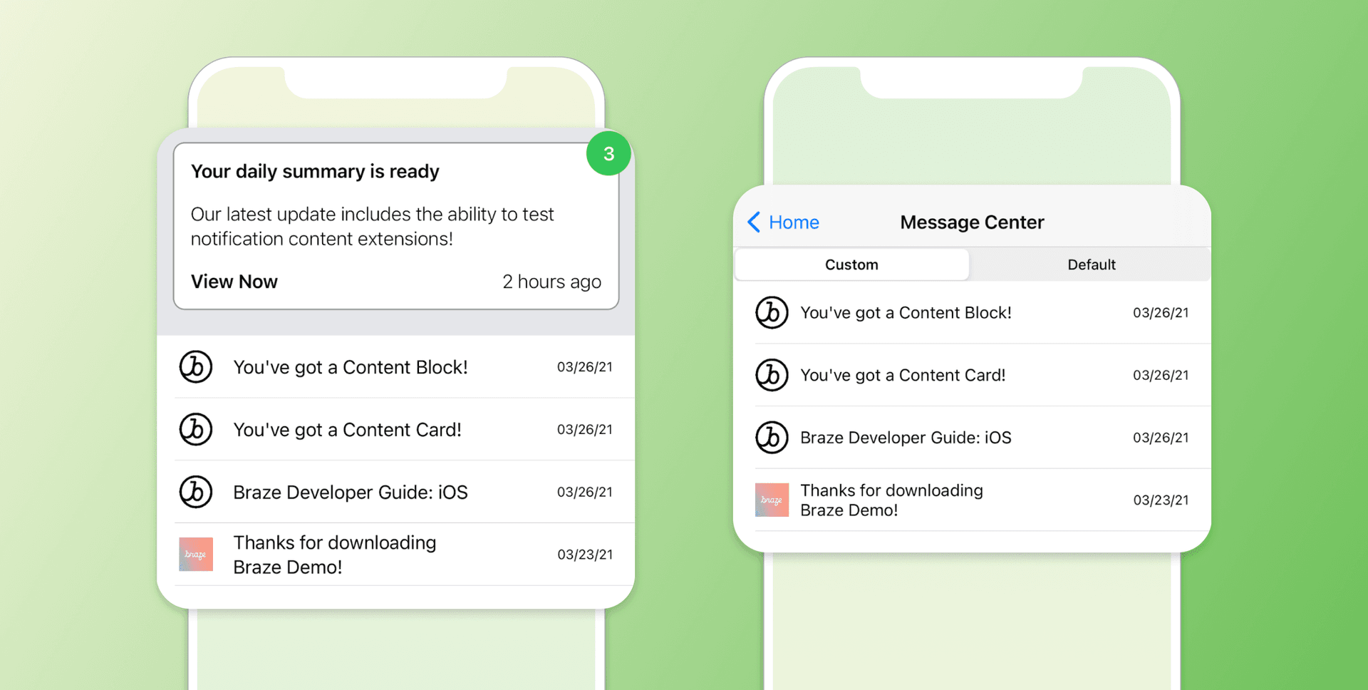
Here’s the snippet of code it takes to implement a vertical scrolling list in UIKit:
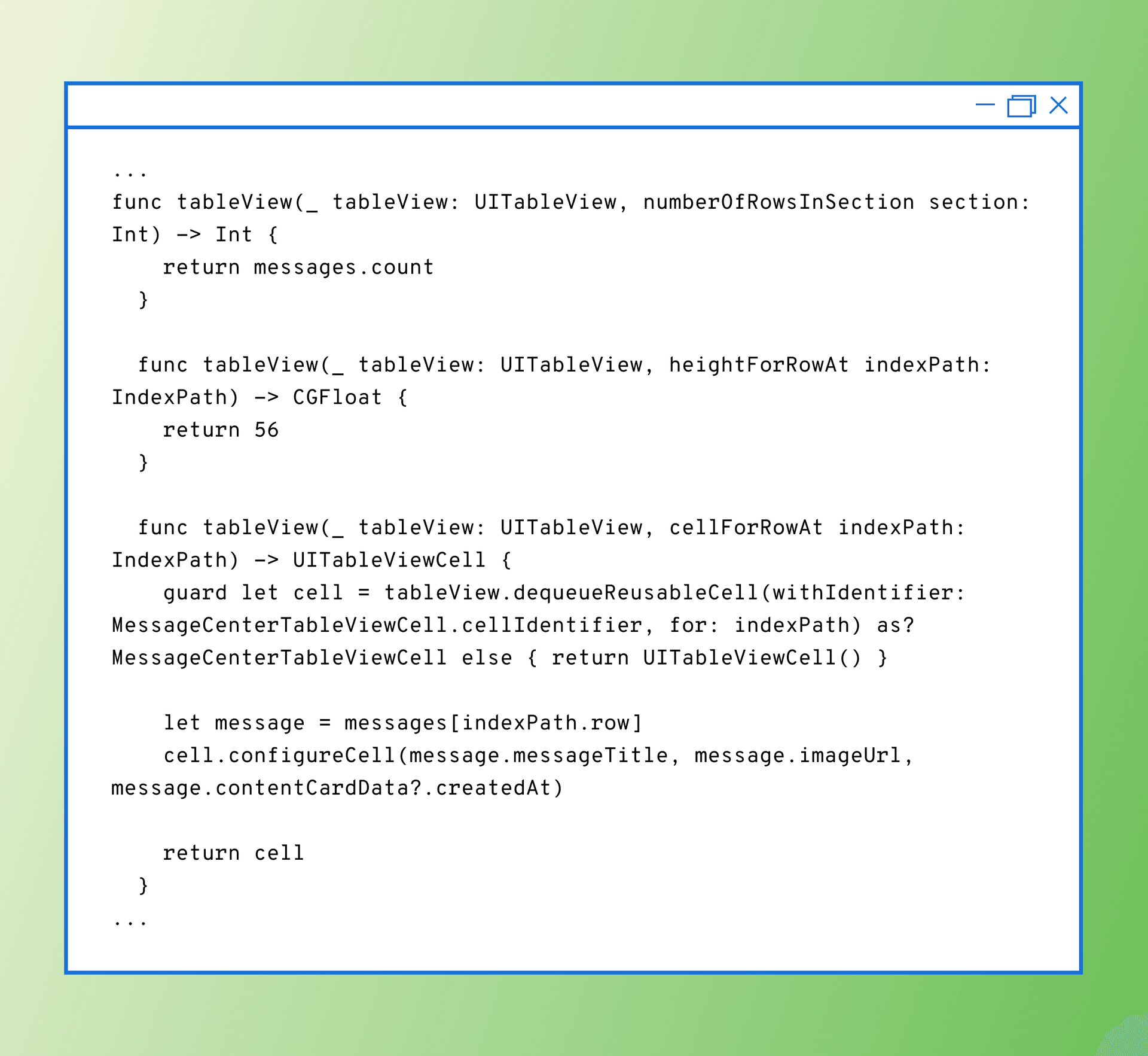
The bulk of this snippet is made up of boilerplate UITableViewDataSource methods that have to be written out every single time when working with a UITableView; there’s actually even more code here than I’ve provided in the snippet, but you probably get the idea.
Now, let’s take a look at the equivalent snippet in SwiftUI:
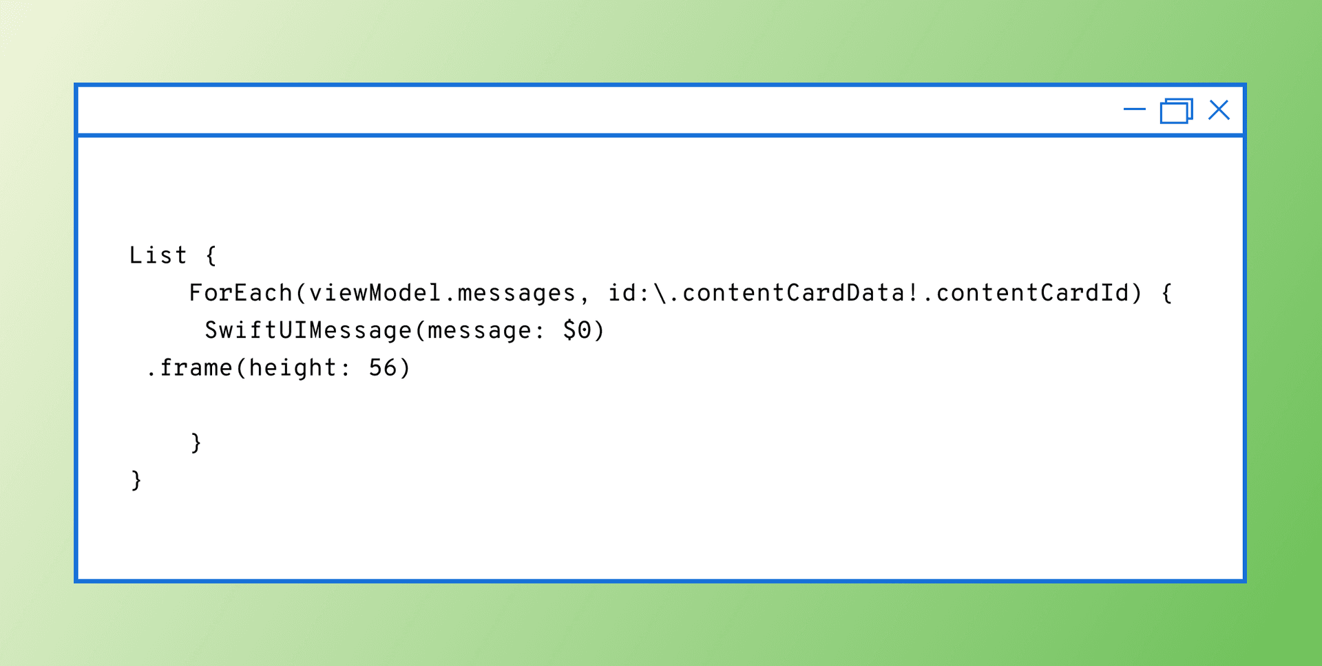
As you can see, SwiftUI makes it possible to accomplish the exact same result as that voluminous UIKit snippet with a simple List object and a for-loop. Scrolling lists serve as the foundation of many views in iOS, so it’s quite refreshing to be able to support them while writing significantly less boilerplate code. Plus, during my development, I found that there was never a need to compile my code when I made layout changes, thanks to SwiftUI Previews; that change has already saved me countless hours of development time.
Putting the User Interface in SwiftUI
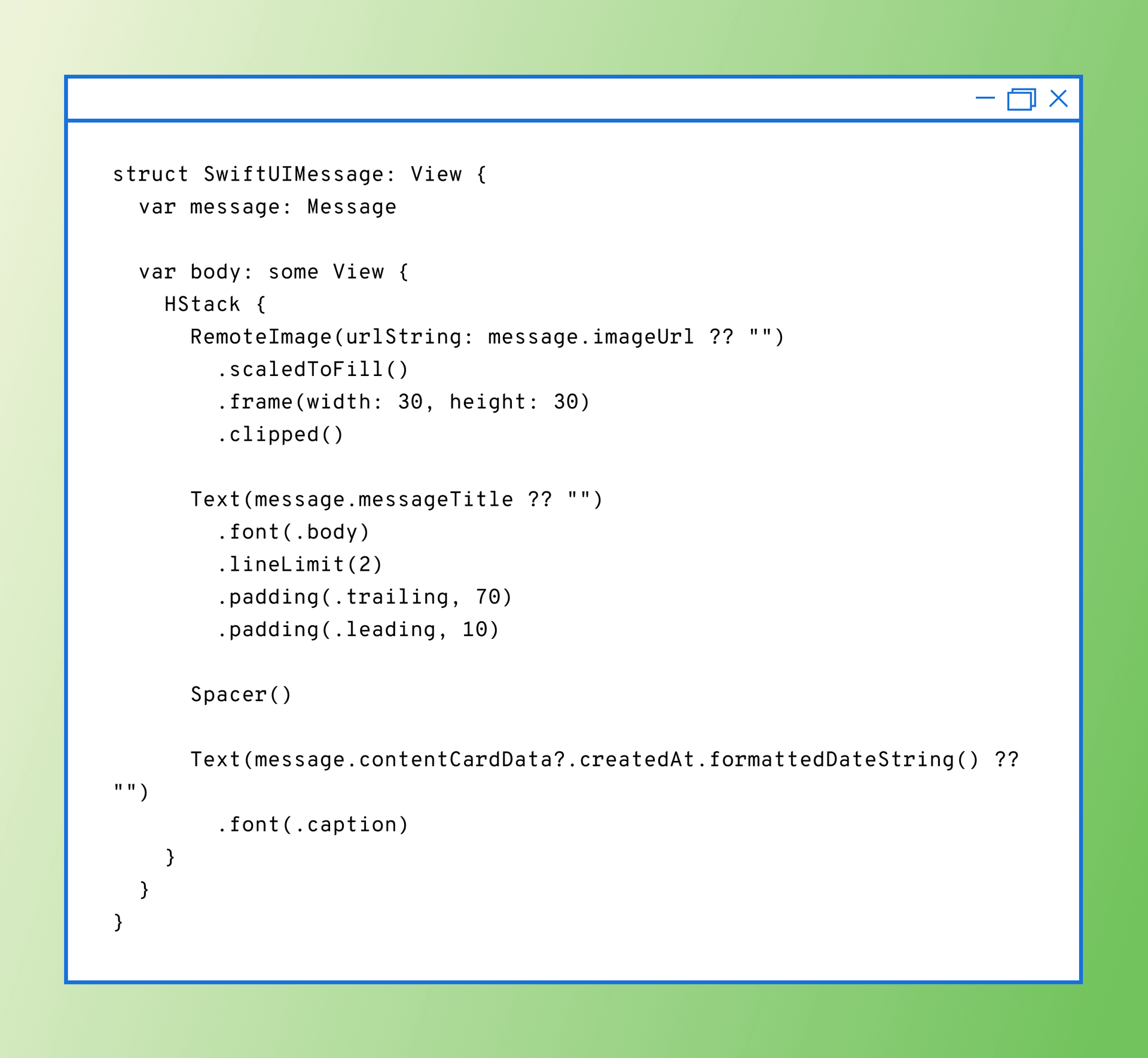
Another benefit of SwiftUI? It replaces the need for developers to use any type of Storyboard or interface builder when working with Swift. Now, don’t get me wrong—Storyboards are fine and dandy in many circumstances. But once you start developing with more than one person in more than one branch, all it takes is a couple of layout changes to find yourself in merge conflict hell. As a result of these potential issues, developers generally have to write UI programmatically.
With SwiftUI, however, creating that message view can be comparatively simple and streamlined. In fact, making that happen can be as simple as the code snippet seen below:
Building Vertically Stacked Content with ZStacks
Another key element of SwiftUI is its support for the ZStack, which is a dedicated stack type that makes it easier for developers to scalably create content that overlaps. In my role at Braze, I’ve been asked on numerous occasions how to build a z-axis stacked carousel of Content Cards and it’s long been my contention that doing so should be possible with SwiftUI. And after a little experimenting, I now have hard evidence to back that up:
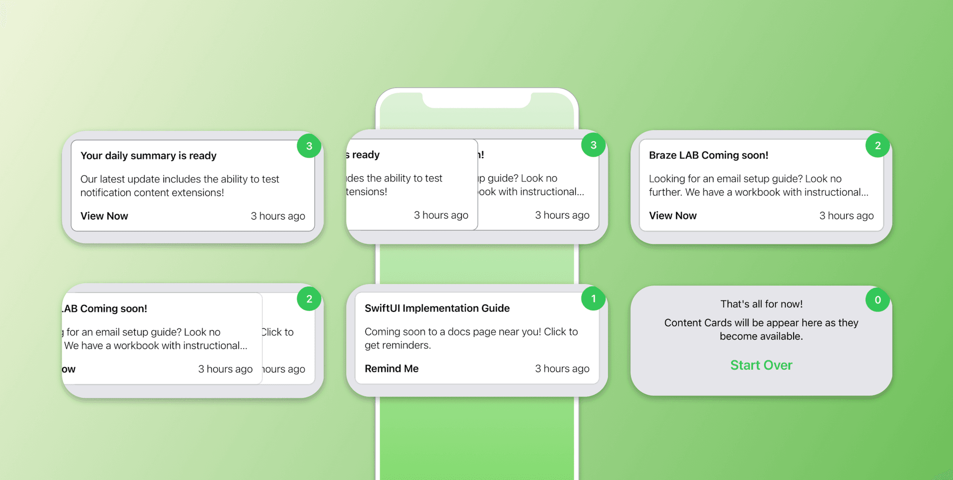
Because the ZStack didn’t exist prior to the launch of SwiftUI, developers who were looking to build out views like this had to turn to subview manipulation without any explicit iOS APIs. As a result, that meant that few developers were willing to even try to create these kinds of experiences, making it difficult for brands to leverage them in their customer engagement efforts. But with SwiftUI, they’re suddenly a real, achievable option—which is quite exciting if I do say so myself.
Content Cards in SwiftUI
One fundamental difference between UIKit and SwiftUI that we haven’t yet touched is their different architecture patterns. UIKit has traditionally been rooted in Model-View-Controller (MVC) principles, while SwiftUI’s de facto pattern is model–view–viewmodel (MVVM) and that difference matters when it comes to integrating Content Cards within iOS. Because UIKit is MVC-based, the view controller is responsible for fetching Content Cards; however, because SwiftUI has no view controller to work with, the fetching code gets delegated to the view model. Given that, SwiftUI provides developers with a new technique for requesting and receiving Content Cards from the Braze iOS SDK. Take a look at the following snippet for one way to handle that process using SwiftUI:
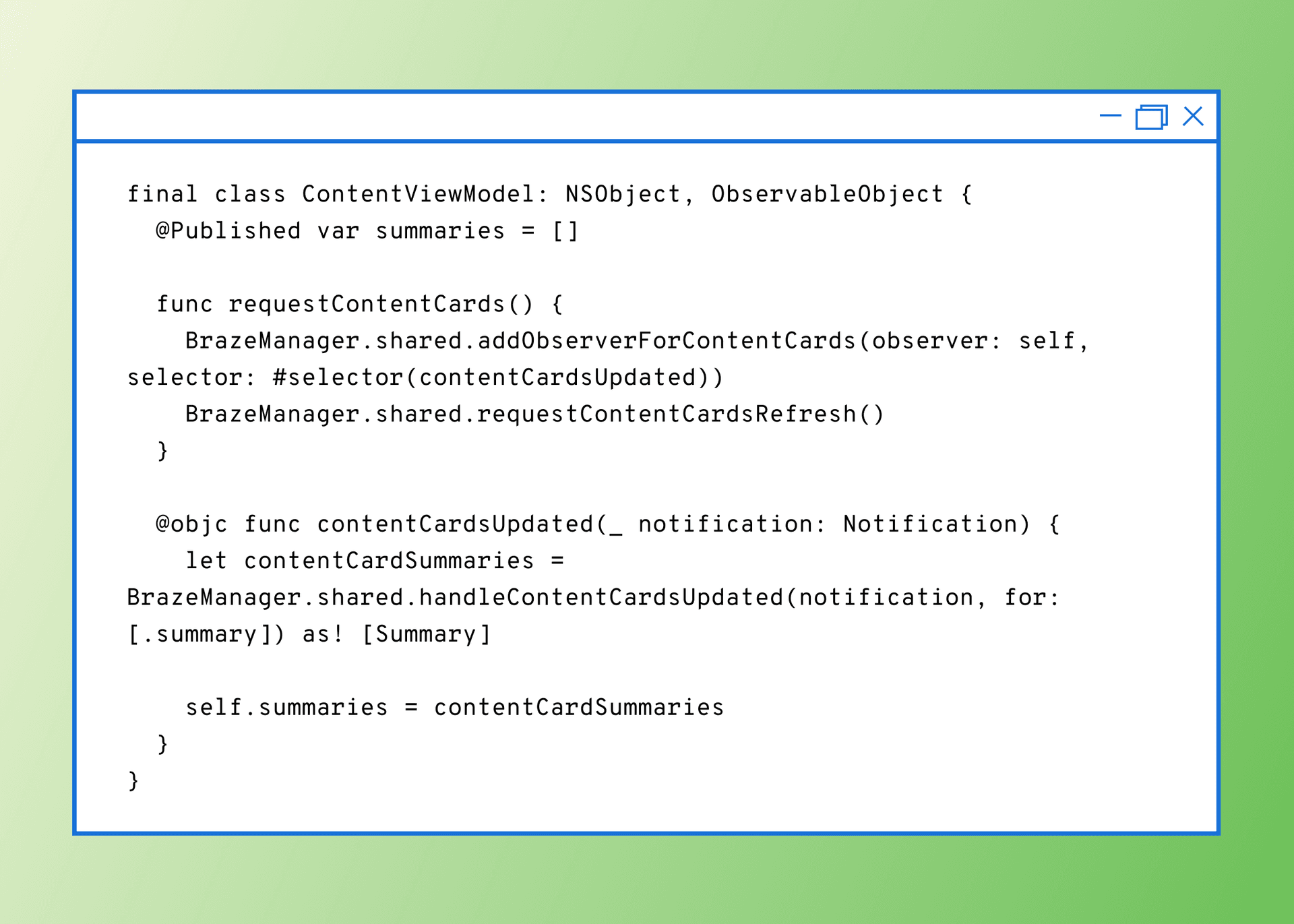
In this case, our data are the Content Cards themselves, represented as an array of Summary objects (as seen in the Z-stack screenshots). The array is marked @Published, a property wrapper, to notify any elementing listening that the Content Cards have been loaded.
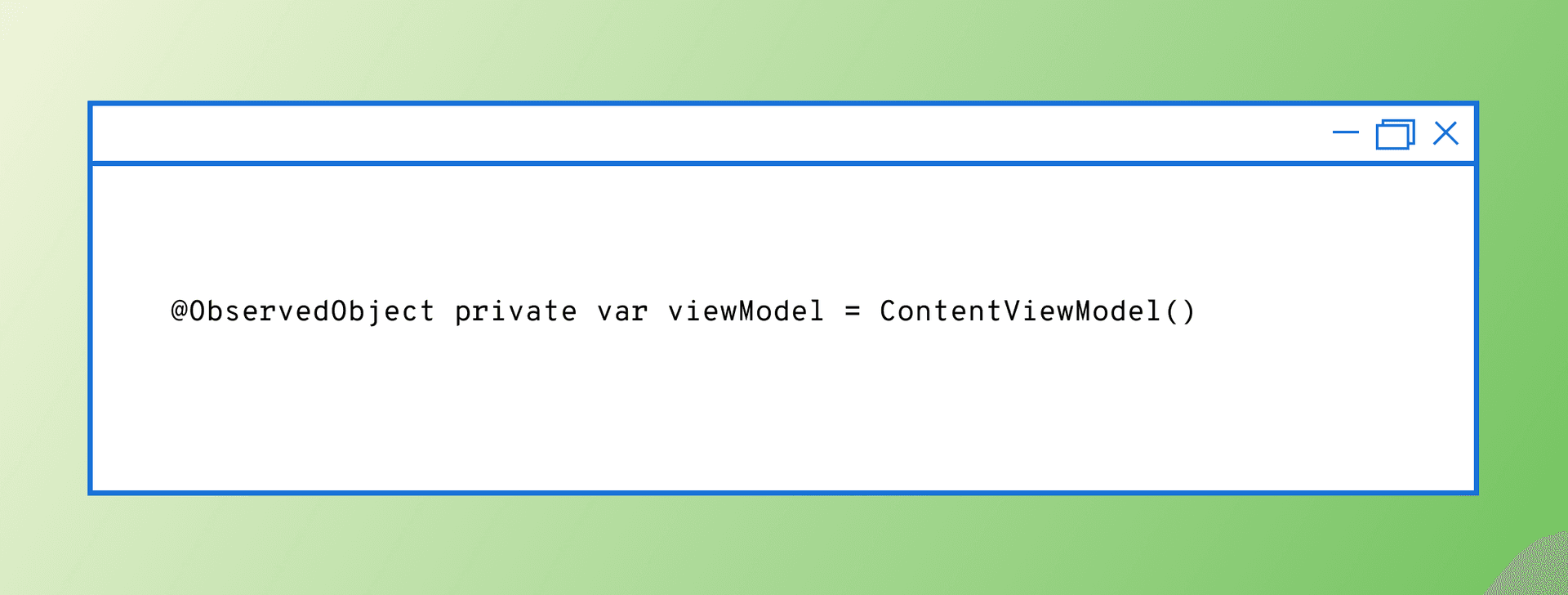
Another new property wrapper type made possible by SwiftUI is ObservedObject, which signals that the view needs to update when the view model updates. This is done so that when the Content Cards are loaded and set in the summaries array, the data can be displayed accordingly in the view.
For more on how to display Content Cards in custom UI, check out our Content Card Implementation Guide.
Coming Soon to an App Near You
At this point, you may be asking what’s stopping people from moving wholesale from UIKit to SwiftUI. There’s a few reasons—including the work involved in getting up to speed with SwiftUI, possible comfort and familiarity with UIKit—but one big factor is iOS versions.
In part because it’s comparatively new, SwiftUI requires a deployment target of at least iOS 13, which rolled out in 2019. For some brands, that precondition may not matter, but for companies like Braze that need the ability to support much older versions of iOS, forcing SwiftUI into an existing project can end up being an unnecessary burden, rather than a net benefit. However, it’s worth remembering that Swift took a few years to catch on and become the de facto language of choice for iOS development, so I wouldn’t be surprised if SwiftUI ends up seeing a similar adoption trajectory.
Final Thoughts
Speaking for myself, trying out SwiftUI has been an enjoyable challenge so far, one that’s led me to rethink how developers can approach building out complex user interfaces. SwiftUI is here to stay and its simplicity and flexibility makes it both a powerful tool for creatively solving problems in the ever-evolving landscape of UI development and something developers in this space would do well to keep an eye on.
To learn more about the technical side of the Braze platform and how it influences what’s possible for customer engagement, check out our documentation.
Interested in joining Braze? Check out our open roles on our careers page.
Related Tags
Be Absolutely Engaging.™
Sign up for regular updates from Braze.
Related Content
View the Blog
The power of mobile app automation: Benefits, use cases, and best practices

Team Braze

Customer onboarding automation: Benefits, strategies, and best practices

Team Braze

Moving beyond demographics to true understanding: Key insights from Grow with Braze Seoul 2025
