How Sunnyside Achieved 85%+ First Week Retention Through Personalized Onboarding
Published on September 09, 2020/Last edited on September 09, 2020/6 min read


Nick Allen
Founder and CEO, SunnysideOver the last 12 years of scaling companies large and small, across industries from B2B SaaS to transportation and even beauty, I’ve had the honor of working with some of the best minds in the industry to unlock new opportunities for growth. While the experiences have varied greatly across different organizations, business contexts, and customer profiles, one principle has remained constant: To succeed in activating, retaining, and monetizing customers, it’s absolutely critical to nail the first impression.
When I set out to build Sunnyside (formerly Cutback Coach)—with the mission of normalizing the conversation around alcohol health and making tracking drinks as common (and socially accepted) as tracking calories and steps in order to support proactive health and wellness routines—I spent a lot of time thinking about my past experiences building first-time user experiences across product and marketing channels. I’ve distilled a few key principles below, and illustrated them with examples from the onboarding experience we’ve built for new signups to Sunnyside.
Principle #1: Introduce Intentional Friction to Load Triggers
The first principle I’ll share is probably the most controversial. While much of the traditional growth zeitgeist espouses the need to remove as much friction as possible from the signup flow in order to maximize signup completion rates, my experience has led me to see things from a different perspective. Your onboarding flow is your first opportunity to learn exactly what new signups want to gain from your experience, and it’s often when they’re most excited and willing to invest time in getting set up. Don’t miss this chance to collect as much information as possible about your new users.
At Sunnyside, we’ve pushed this philosophy to what some would consider an extreme. Our signup diagnostic takes about five minutes to complete and consists of more than 30 screens, some of which I’ve shared below. We ask members about their high-level goals and motivations, their current drinking patterns, and their demographic information, all while interspersing the flow with guidance on what to expect from us in return. While we certainly do shake some users off along the way, we’ve found that requiring this upfront investment helps us to identify users with the highest intent, and to serve them an incredibly personalized experience from the outset.
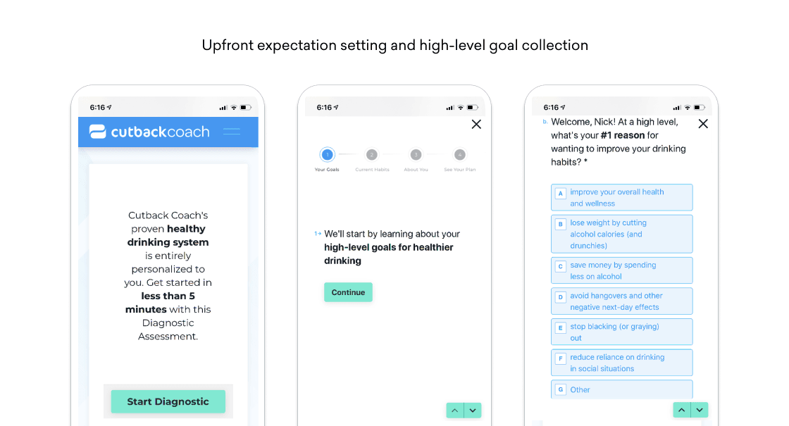
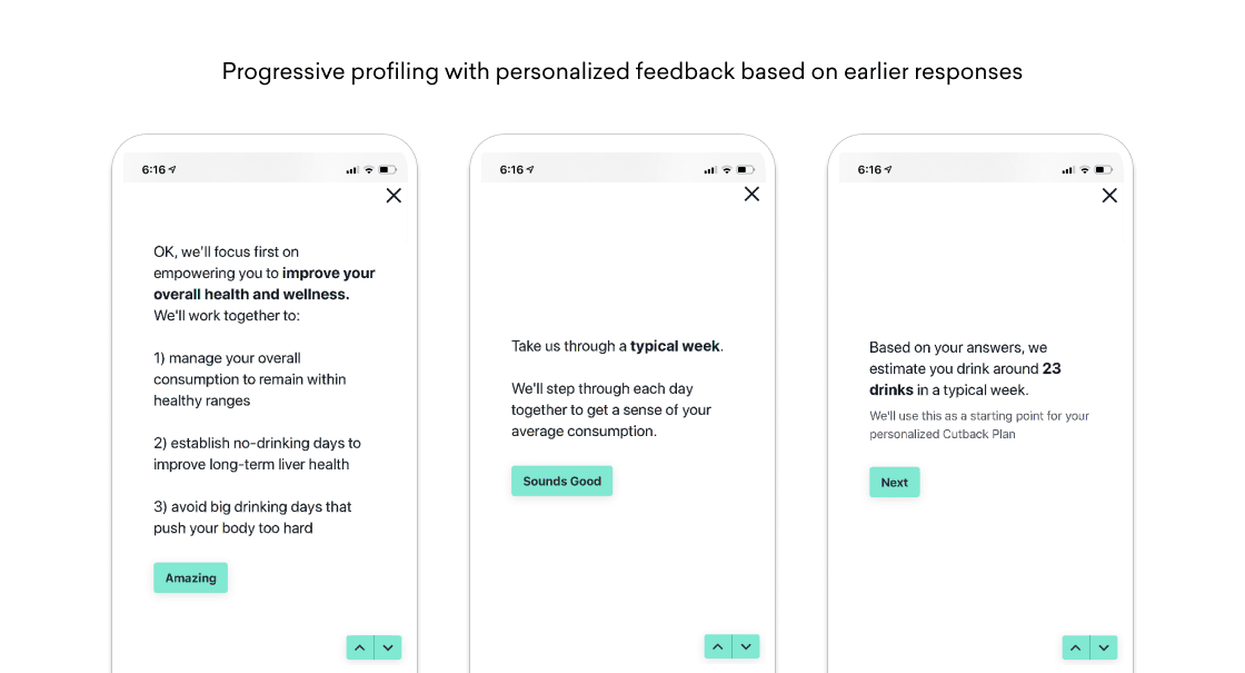
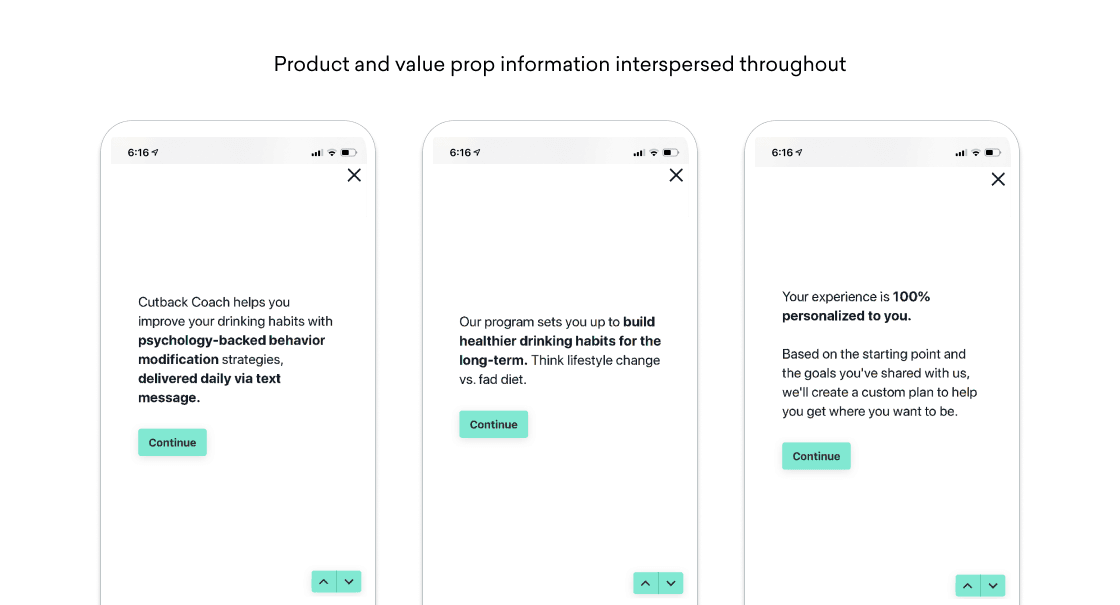
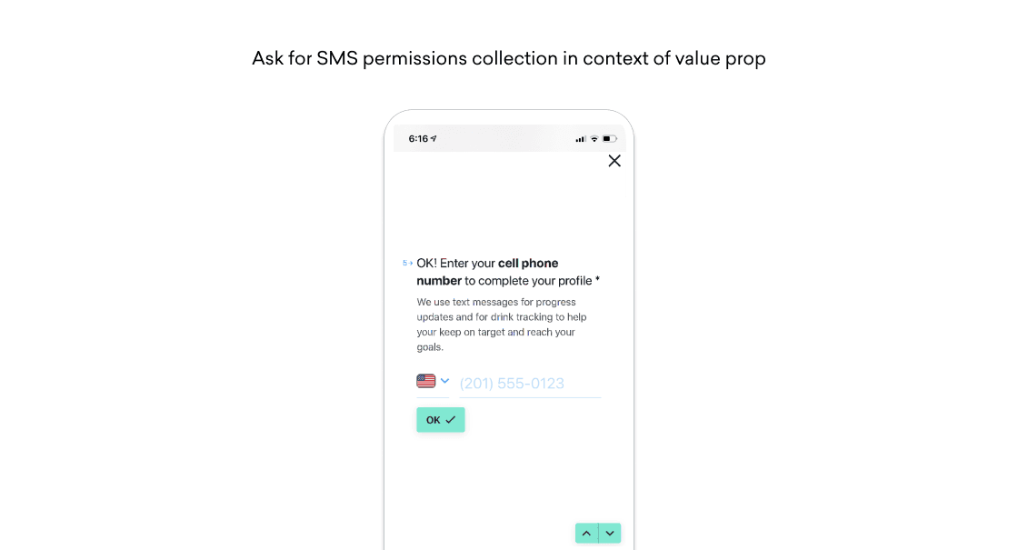
I’m not suggesting you should add friction for friction’s sake, just that you should recognize your signup flow as an opportunity to prepare a deeply personalized experience for new members. Be thoughtful about the data you collect, and intentional about making sure you reward users for providing you with this key information.
The best way to make that happen? Show them as quickly as possible how you’ll use it to enrich their experience.
Principle #2: Lead With Personalization Out of the Gate
Your next step? Provide new users with a payoff for the investment they’ve made in getting set up. There’s no more frustrating experience than spending an extended period of time onboarding to a new product only to land on a generic end screen. This moment is where your high-friction engagement strategy is made or broken.
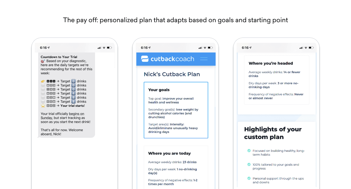
Show your users in the first session why providing the information they shared was worth their time. This requires being strategic about what information you request, and how you structure the data to be immediately actionable (ideally by both your product and marketing teams). For Sunnyside, the payoff is a personalized plan that adapts based on user goals, baseline drinking habits, and demographic information (where scientifically relevant).
The personalized experience we deliver is consistent across onboarding SMS messages and our website, providing an integrated experience that feels like a single continuous experience instead of a disjointed patchwork.
Principle #3: Get Users to Meaningful Usage on Day One
Now that we’ve gotten users signed up, our goal is to get them to engage meaningfully with the core product experience as quickly as possible. Depending on your product’s usage patterns, it may not be possible to get user’s all the way to the “A ha!” moment on day one, but at the very least it’s critical to show your users a well-lit path for your users to how they’ll get there.
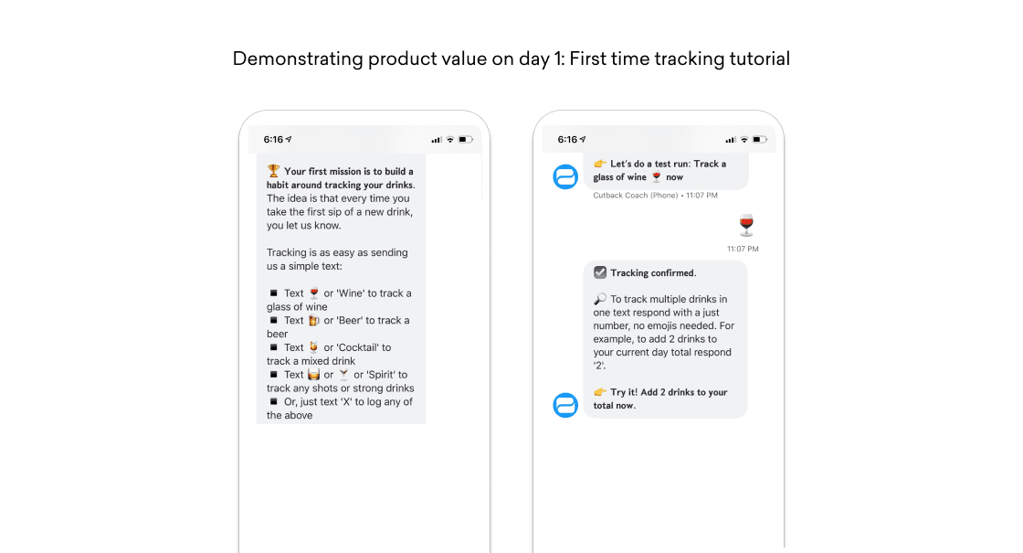
What does that look like? Consider Sunnyside. Our members aren’t going to achieve fully optimized drinking habits on day one, so instead we focus on showing them how small, atomic actions they can take will get them there. For us, that’s getting new users to track their first drink and helping them to understand how the core engagement pattern works to help them build mindfulness about their consumption.
Here’s our first-time user SMS experience, driving members to practice tracking in a simulated tutorial:
One more thing: Be selective with the training you provide upfront. Don’t expect your new signups to be power users from day one. Give them just enough training to get started with the core patterns of your app or service. Save the more complicated features for later on.
Principle #4: Progressively Unveil New Features Over Time, in the Context of Usage
You’ve nailed the first-time user experience, from first visit to sign up and first product interaction. Now, your goal is to turn every user into an expert, allowing them to get the most out of your product. But not every user will necessarily want or need every feature you’ve built. This is where context is critical.
For each incremental feature your product is capable of, think about the times in the user experience where your users would need it most. Here’s a quick example of how we teach our users about the ability to correct a previous day’s total with a specific response language:
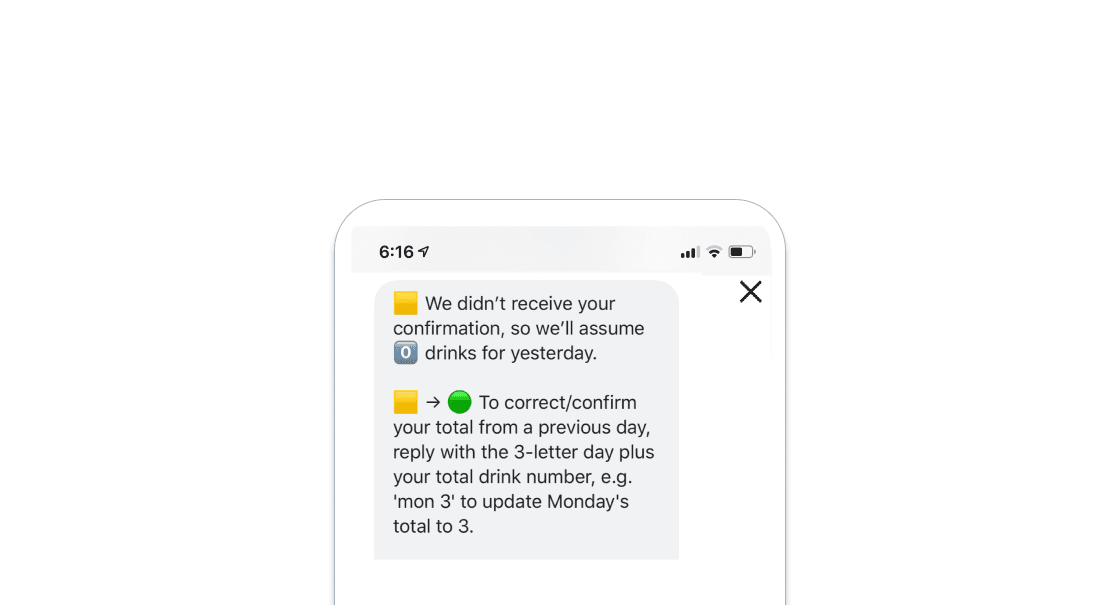
We surface this message as soon as a member misses their window to confirm the previous day’s total, which effectively ends their tracking streak. With the pain of seeing their streak go to 0, we give them an easy way to restore it, helping them stay engaged and avoid disappointment.
Bring It All Together
While these principles are far from exhaustive and may not be right for every business, there’s value in learning about how we’re thinking about the new user experience at Sunnyside. Feel free to shoot me an email at [email protected] if you have questions, comments, or there’s anything I can help you with!
Related Tags
Be Absolutely Engaging.™
Sign up for regular updates from Braze.
Related Content
View the Blog
Look out: Outlook's new email requirements and what they mean for Braze senders

Alison Gootee

How the Braze Data Platform enhances flexibility and fosters collaboration

Sahiz Kaur

Customer churn prediction: Using data for smarter retention
