Why Accessibility in Email Marketing Really Matters: Guidance from an Industry Expert
Published on August 07, 2019/Last edited on August 07, 2019/7 min read


John Thies
CEO and Cofounder at Email on AcidAccording to the World Health Organization (WHO), 1.3 billion people worldwide live with some form of visual impairment, 217 million of those individuals are living with moderate to severe vision impairments, and approximately 36 million people worldwide are blind.
To put that into perspective, the population of the United States in 2018 was 327 million.
With so many people worldwide living with visual impairments, it’s incumbent upon businesses to think about how to ensure that the messages they send are accessible and comprehensible for impacted customers. It’s the right thing to do, but it’s more than that—it’s also smart business.
What Accessibility Means for Businesses
Accessibility is far too often treated as an afterthought for brands. The need for accessibility standards extends into digital media, particularly in email marketing. By failing to make emails accessible, organizations are potentially missing out on effectively communicating with a large portion of their subscriber list. When accessibility is not a consideration within a campaign, someone who is a highly engaged subscriber might not be able to interact if they have a temporary or permanent disability.
Wondering what that might look like? When I was a kid, my Dad broke both of his thumbs while playing softball. If he did that today, how would he interact with a smartphone or computer without some form of assistance? What if he was your most engaged subscriber? How would he be able to take any action on the emails your brand sends if he can’t properly engage with them? When he finally got his casts off, would he still be as engaged as he’d been previously? (Probably not.)
I’d like to put some real impact numbers around the accessibility statistics I mentioned above. Roughly 17% of the global population lives with a visual impairment, but let’s imagine that only 5% of your 100,000-person subscriber list falls into that group. That’s 5,000 subscribers that might not be able to fully engage with your campaigns! Being unable to connect with that many subscribers is a big problem for your engagement efforts. You’ve worked incredibly hard at organically building your subscriber base, so don’t waste all that time and effort by falling down on the job when it comes to accessibility.
In a world where it’s estimated that nearly 246 billion marketing emails are sent and received per day, it’s my belief that the accessibility mindset should be a default practice in every organization’s email marketing strategy.
6 Easy Adjustments for Making Emails Accessible
Understanding the importance of sending accessible emails is one thing; knowing how to take steps to make that vision a reality is something altogether different. So let’s walk through some quick and easy changes you can make that will have a dramatic improvement on the accessibility of your email campaigns.
HTML Language Tag
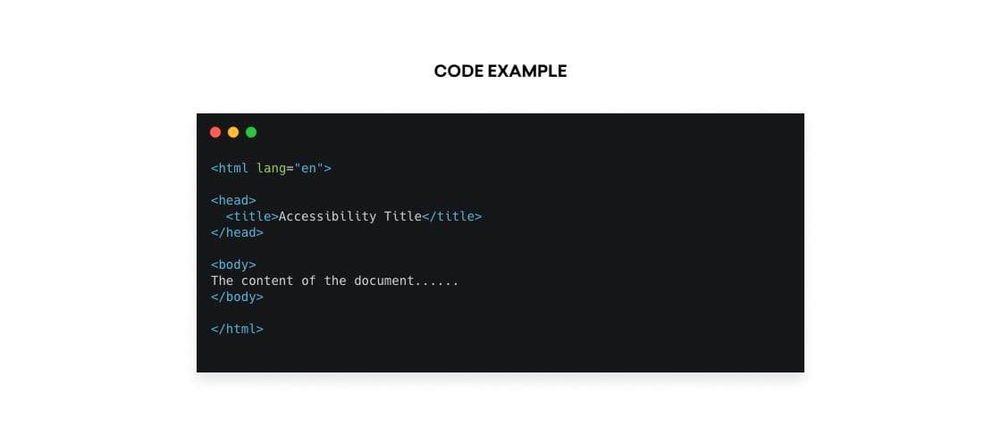
Setting the language attribute to the HTML tag is a simple fix made in the head of the email. This attribute tells screen readers and other non-human systems, such as search engines, to expect a certain language and pronounce or display the words in a specific way.
The value of the “lang” attribute is generally two letters that correlate to the language the email is written in, such as “en” for English. If the email was written in Spanish, you would use “es.” Here’s a handy list of HTML language codes.

HTML Title Tag
Proper use of the <title> tag has two benefits for email subscribers. First, this tag will set a title on the tab of the webpage when viewing the email in a browser. It also provides a title and some additional context for users using assistive technology to consume messages, making it easier for them to understand up front what they’re being shown.

Alt Text
Most email developers and marketers know the importance of alt text; you should set it to ensure your subscribers can see some context of the images contained in your email messages when image blocking is enabled on their end.
Alt text also serves an important purpose for accessibility. Setting the right alt text will enable screen readers to accurately interpret the purpose of the image using words. You’ve heard of the phrase “A picture is worth a 1000 words”. This attribute serves that purpose from an accessibility perspective.
However, not all images need alt text. If you’re using an image purely for the aesthetics of the email (such as a spacer image or shadow), be sure to set an empty alt=”” on the image. This tells the screen reader to skip over these images.
If an “alt” attribute is not present within the “img” tag, the screen reader will instead read the “src” value. That’s likely to lead to a subpar experience for the subscriber, and it’s easily preventable. From now on, always be sure to include the “alt” attribute, even if it happens to be blank. It’s the thoughtful thing to do.

Table Roles
Fixing “tables” is another quick fix that is arguably one of the most important adjustments to an email form an accessibility perspective. Given that emails are developed using “table” tags, lots of them, screen readers interpret “tables” as tabular data—think about how Microsoft Excel and other spreadsheet programs are setup with columns and rows.
If a table doesn’t contain a “role” attribute with a value of “presentation,” the screen reader will read every table as though it contained literal column and row information. But that is not the intention for “tables” in email HTML. In email, they’re used to create the structure and design. The “role” attribute needs to be included in every table within the HTML, including those nested within other tables.

Contrast Ratio
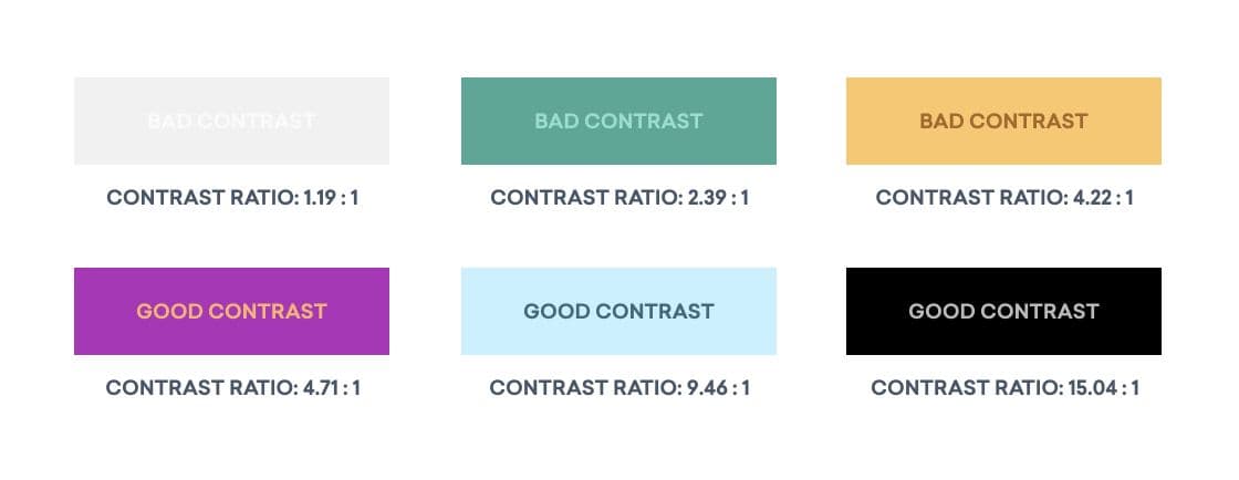
Contrast ratio is the variation between the background color and the foreground color. In an email, the foreground color is often the color of text you’re working with, but it can also apply to graphics, diagrams, or logos contained within your emails. This is especially important for those individuals who cannot see certain colors. Colors that have a lower contrast ratio can be difficult for certain people to read; those with vision impairments may have trouble discerning text that is too close to the background color.
Check out the diagram below for examples of good and bad contrast examples. Try squinting your eyes a bit and see how difficult it is to read the bad contrast examples:

Text Alignment
Although it can be aesthetically pleasing to have your text in the center, it can be much harder for people with dyslexia to read center-aligned text. For audiences who have English as their preferred language (or any language that you read from left-to-right), make sure that you left-align any large bodies of text—that is, anything that’s three or more sentences long—to improve comprehensibility for this segment of your audience.

Tools to Automate Accessibility Validation
Making email 100% accessible can be done manually—however, there are a lot of standards and rules that need to be considered in order to do it right. The great news is that Email on Acid has a platform that makes this process super easy! All of the adjustments mentioned above and many more can be done with a few clicks of a button.
It’s our job as marketers to engage and build emotional connections with each and every one of our subscribers. Everyone deserves the opportunity to have easy access to digital content and we can help make that a reality. Please, join Braze and Email on Acid in spreading the word around the importance of accessibility and make a positive impact on someone’s life!
Related Tags
Be Absolutely Engaging.™
Sign up for regular updates from Braze.


