This is How You Get App Users to Refer Their Friends
Published on August 25, 2017/Last edited on August 25, 2017/4 min read


Kelsey Cottingham
Editor, Content Marketing at BrazeDear reader: This blog post made its original debut in Appboy’s Relate Magazine. Pocket its pearls of wisdom, and then for more information, check out our new Cross-Channel Engagement Difference Report!
It’s becoming more and more important for brands to prove their value to users at every stage of the customer lifecycle. That can mean onboarding, sure, but often even your active users are missing out on important aspects of your app—whether it’s a new promotional campaign or a long-standing, underused feature. It’s never too late to educate your users, and a cohesive, cross-channel campaign can be just the way to do that.
Today’s addition to our inspiration file is this cross-channel, educational campaign from Robinhood that encourages users to invite their friends to the app. Robinhood is a free stock trading app, and, true to the Robinhood name, one of the perks of the app is spreading the wealth. When a user invites a friend to download the app, both the user and their friend get a free share of stock. Better yet? Those stocks can come from titans like Facebook, Apple, and more.
While asking users to invite friends to an app can sometimes come across a little needy or intrusive, Robinhood does an exceptional job of demonstrating value to their users and making it as easy as possible to share. Here’s how Robinhood gets it right:
Clear, Concise Messaging
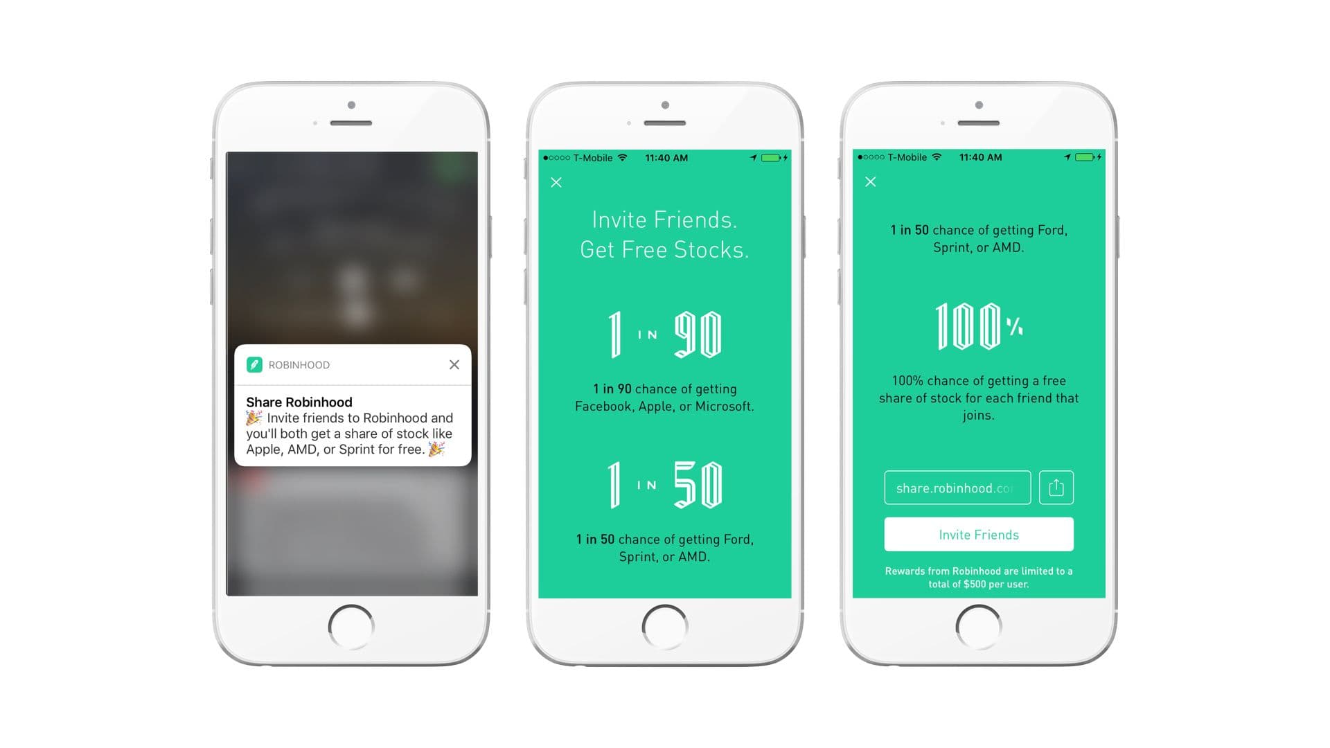
Robinhood starts this flow with a push notification that gives just enough detail to get users to tap (the party emojis definitely help make the message feel exciting). Once the user taps on the push notification, they’re brought to an educational messaging flow that gives an honest take on the promotion while still creating excitement. Plus, the design is clean and easy to digest and navigate quickly. (Kudos to their design team.) Then in the in-app message, it’s revealed that users who invite friends have a 1 in 90 chance of of getting free share of stock from giants like Facebook, Apple, or Microsoft.

The odds get better and better as the message continues, so if you weren’t sold on the 1 in 90 odds, maybe the 1 in 50 for Ford, Sprint, or AMD, or the simple 100% promise of a free stock will be enough to get you to keep reading and ultimately to share. Overall, the messages are clear, beautifully designed, and are organized in a way that keeps users reading.
Cohesive, User-Friendly Flow
The flow of this campaign is what really makes it stand out, because Robinhood does the work for the user at every chance. It begins with the push notification, which deep links to the informative in-app message. That’s a great start. We’ve all had those experiences where you see a push you’re actually interested in, but feel lost once you’ve opened the app.
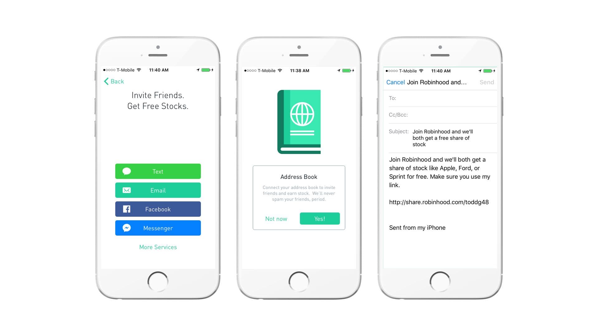
On several occasions throughout the in-app message, Robinhood provides opportunities to share with friends, through either a readily available link you can copy yourself or by tapping on the “invite friends” button. This is where it gets really good. When you tap “invite friends,” you get the option for which channel you want to share on—in this case, email. Next, the user was led to a full-screen message that primed them to provide access to their address book. Robinhood encourages users to connect their contacts so they can invite friends and promises to never spam their friends. By addressing reservations immediately, the user is more inclined to give the permission. Lastly, when the user chooses a contact to share with, they’re brought straight to their email with a sharing template already prepared.

Anything Else?
Robinhood’s creative and informative messaging is a great example of how to engage users in a campaign, keep their attention, and most importantly to show users the value your brand brings to the table. But the even bigger win here is the seamless user-experience from push notification to sharing. Together, Robinhood created an engaging and effective campaign—one that could even turn users into brand advocates.
Be Absolutely Engaging.™
Sign up for regular updates from Braze.


